

15 Beige Living Room Ideas With Subtle Animal Print Accents
A beige living room can feel calm and still look a bit plain, as if every cushion and rug agreed to say nothing at all.
This guide covers beige living room ideas with subtle animal print accents that add pattern in small, quiet doses. The prints stay soft, faded, and close to beige and brown, so the room still reads calm first.
No bold black and white prints appear here, and no room gets more than one print in a single view.
Each idea uses one print at a time, in one clear spot. You will see a single cushion, a small rug, a throw edge, and a low ottoman doing the work, with plain fabrics around them.
Most ideas take under ten minutes, use pieces you can move or wash, and need no paint, no new sofa, and no full room redo at all.
If you want the plain neutral base first, start with our beige living room ideas guide, then come back here for the quiet print layer on top.
This post contains affiliate links. If you buy through them, we may earn a small commission at no extra cost to you. See our Affiliate Disclosure.
1. Start With One Faded Leopard Cushion Only
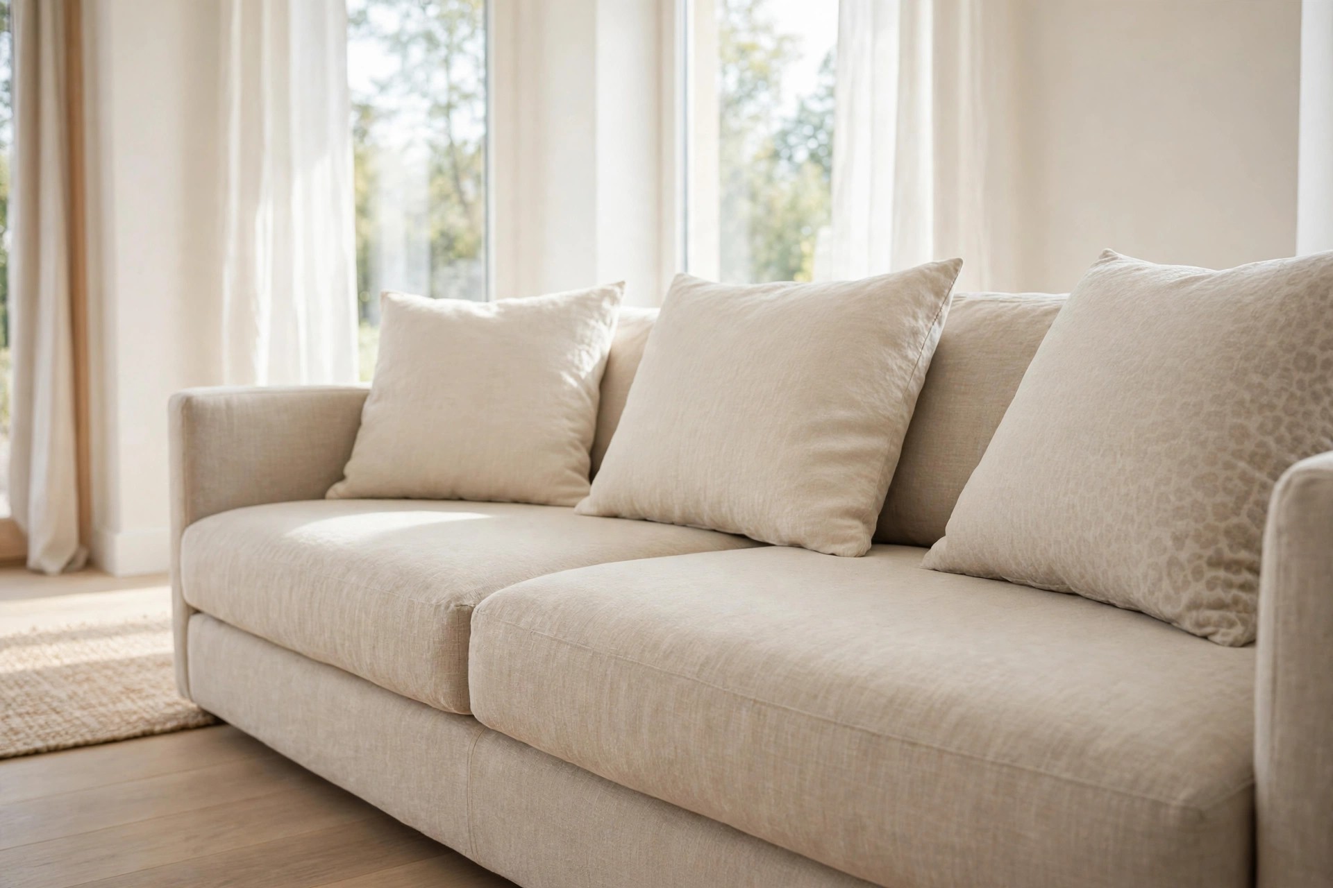
One cushion is the safest first step, and for many rooms it is also the last step needed. Pick a faded leopard print in sand, taupe, and soft brown, with no black outline and no sharp contrast.
Place it at one end of a plain beige sofa, next to a solid cream cushion. The plain cushion gives the print room to breathe, and the print gives the plain sofa a clear focal point.
Turn the cushion over or swap it to a chair for a week before you buy a second one. On the sunny side of the room, pale prints fade faster, so rotate it each month.
Keep the spare cushions plain and stored nearby, so you can test the look on a plain day too.
2. Lay a Small Antelope Print Rug Under the Table
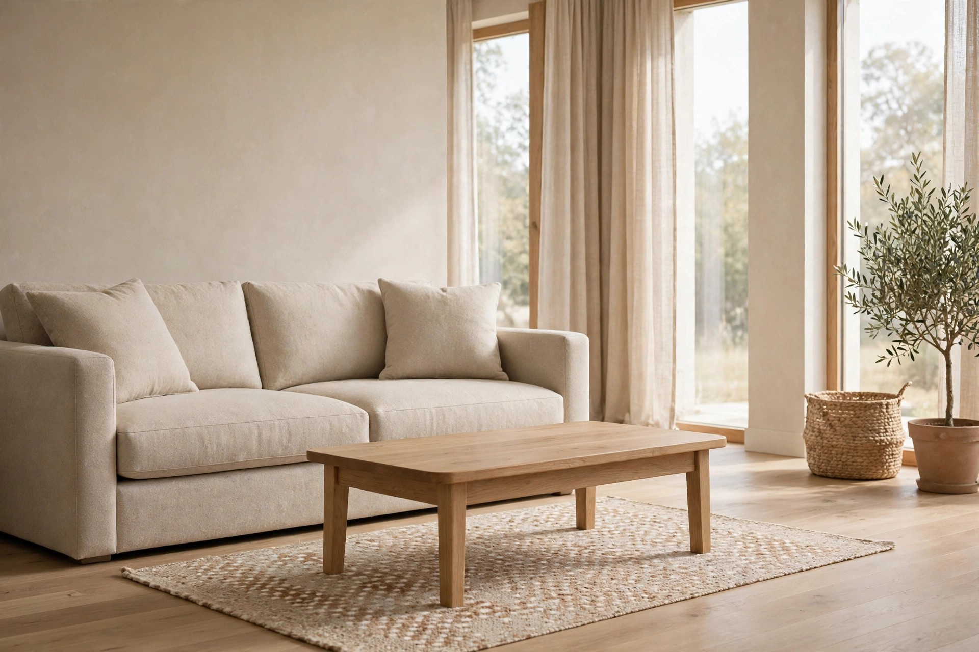
A small rug in a soft antelope pattern can warm the center of the room without covering the whole floor. Choose wide, blurry spots in beige and light brown, spaced far apart on a cream ground.
Slide it under the coffee table only, with the sofa feet on the plain floor or on a larger plain rug below. Our guide to living room rugs with a beige couch shows how that layered edge should sit.
Keep every other textile plain in this view. A printed rug plus printed cushions in the same sight line is where a calm room starts to feel busy and loud.
Leave a hand width of plain rug showing on every side, so the small rug reads as a layer, not a mat.
3. Use a Throw With Print Only on the Border
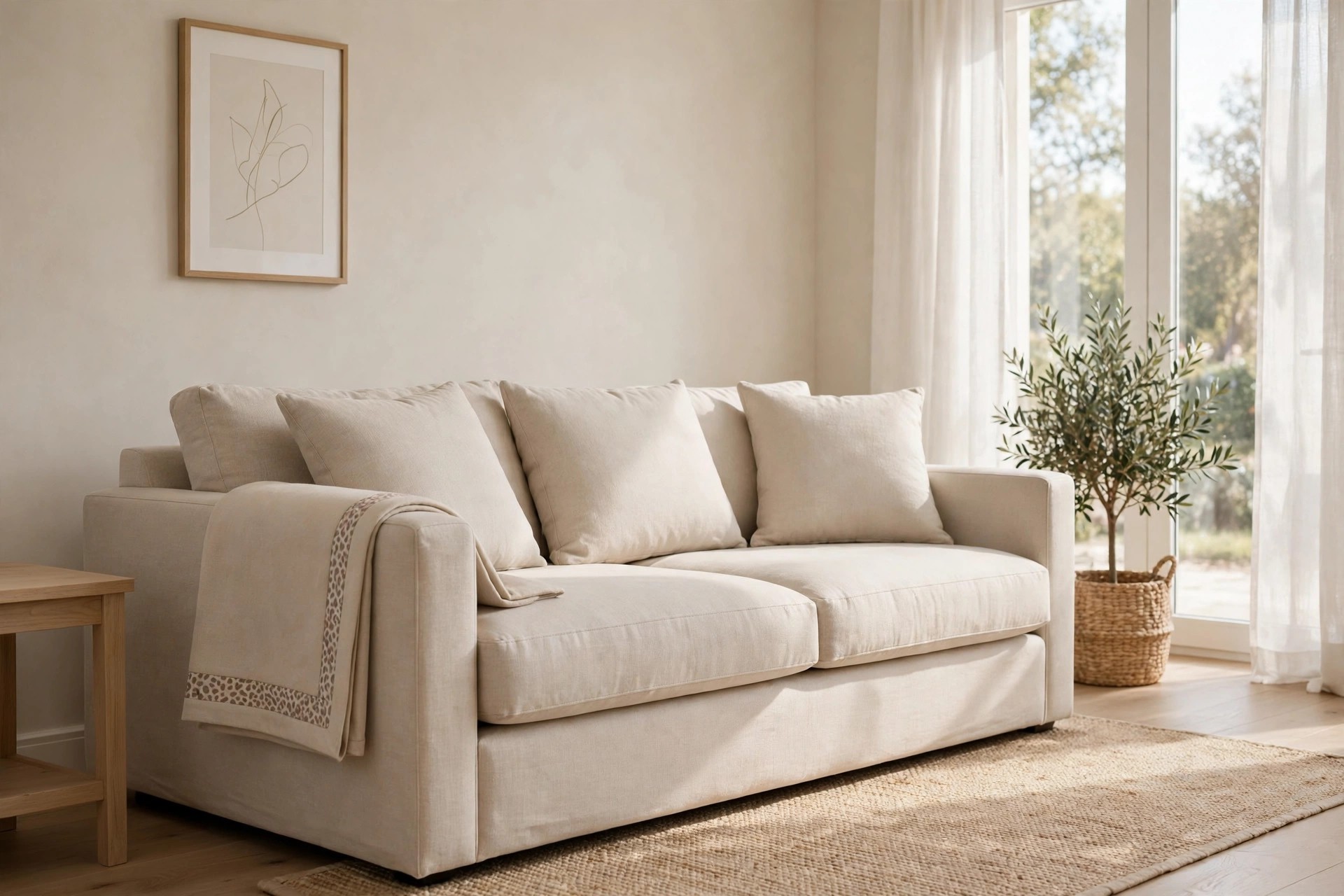
A throw with animal print only along one short edge gives you pattern for a few inches, not a few feet. The main body stays solid beige, and the spotted border does all the talking.
Fold the throw once lengthwise and lay it over one sofa arm, border facing out and hanging down. From across the room you see a calm beige throw. Up close, the small print shows.
Fold it border in on days you want no print at all. That quick flip is why border throws suit renters and cautious decorators so well, since nothing is fixed in place.
In winter, the same throw works folded tighter, with just two inches of border showing over the arm.
4. Let One Taupe Spotted Ottoman Carry the Print
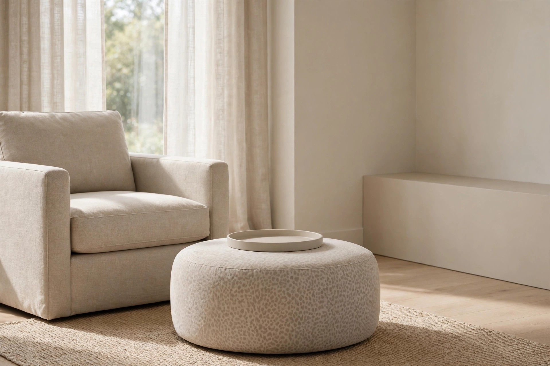
An ottoman is a good home for print because it sits low and covers a small area. Pick soft taupe spots on a warm beige ground, and keep the spots small and evenly spaced.
Set the ottoman in front of a plain armchair or at the end of the sofa, with a plain tray or a folded solid throw on top. The tray breaks up the print and adds a useful flat spot.
Leave the sofa and chairs solid in this setup. One printed piece below knee height reads as a quiet detail. The same print at eye level would feel far stronger and louder.
If the ottoman gets heavy daily use, pick a tight weave. Loose weaves snag and make pale spots look worn fast.
5. Mix One Tiny Print Cushion With Plain Cushions
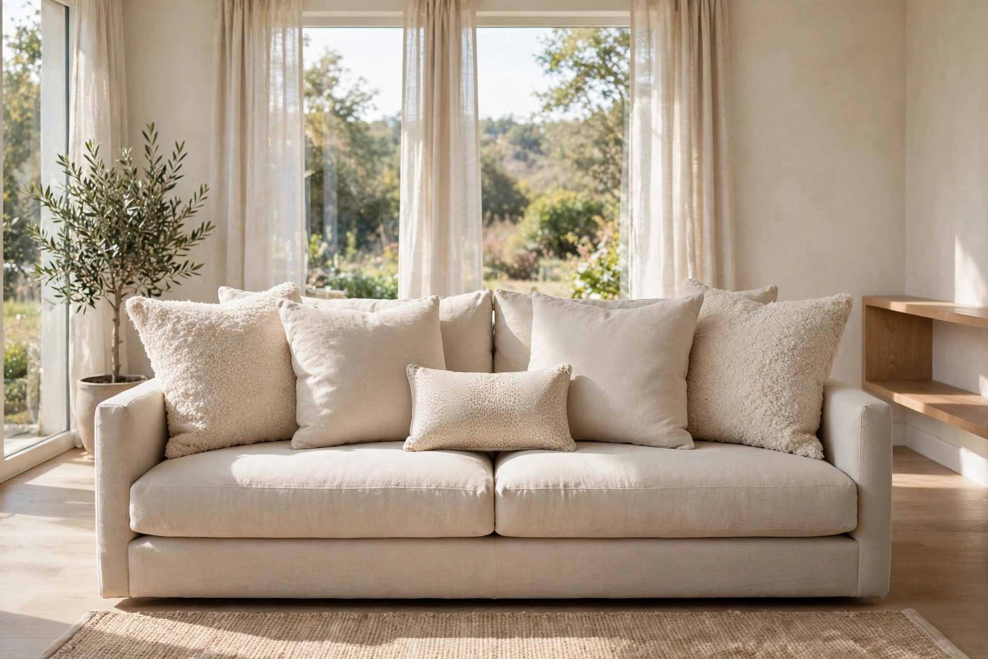
Scale does more work than color here. One cushion in a very small, tight animal print can sit with three or four plain cushions and still look soft, because the spots read almost like texture.
Put the tiny print cushion in front, and keep larger plain cushions behind it in linen, cotton, and boucle. Readers comparing fabric mixes may also like our warm grey rooms with beige upholstery mixes for plain layering ideas.
Step back to the doorway and squint. If the cushion looks like a soft shadow rather than clear spots, the scale is right. If you can count the spots, go one size smaller.
Plain cushion covers in the same beige family can rotate behind the print, which keeps the mix fresh without buying more print.
6. Tuck a Washed Cheetah Lumbar on the Armchair
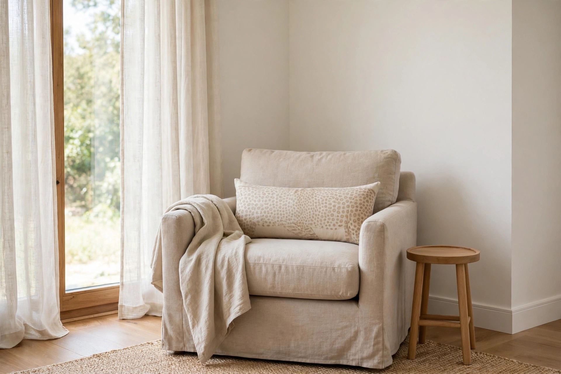
A long lumbar cushion in washed cheetah print suits an armchair better than a square cushion does. The low shape covers less fabric, and the faded wash keeps the spots pale and broken up.
Rest it low against the chair back, with no other cushion stacked behind it. A plain beige throw over the chair arm is enough company. The chair then marks a quiet reading spot.
Pick a cover you can remove and wash. Chair cushions get pulled, leaned on, and moved daily, and pale prints show dust sooner than mid tone plains do in bright rooms.
Avoid pairing it with a printed rug in the same corner. One print per chair corner is plenty for a calm room.
7. Soften Zebra Into Cream and Taupe Stripes
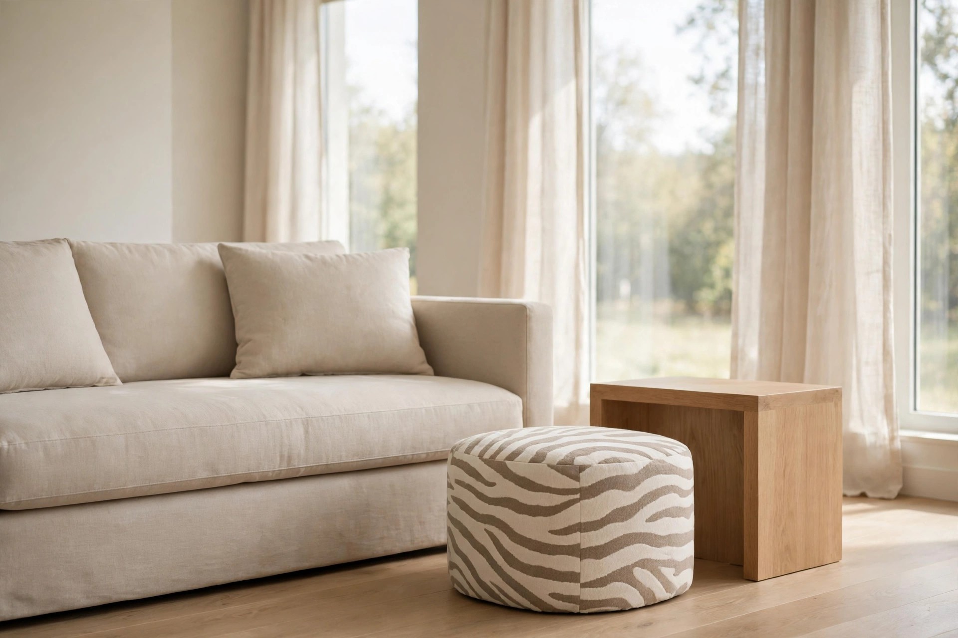
Zebra print turns loud when the stripes are black and white. In cream and taupe, with wavy, uneven stripes, the same pattern reads calm and fits a beige room with no fight at all.
Use it on a small footstool or a short bench, not on a chair or a rug. A small surface keeps the stripe count low, and low stripe count is what keeps the look soft.
Pair the stool with plain wood and plain linen nearby. Glossy or shiny fabrics nearby make even pale stripes look sharper, so matte finishes are the safer choice here.
Bring it out only when guests need it, and the room gains print for an hour, then settles back to plain.
8. Layer a Small Faded Hide Look Rug Over a Plain Rug
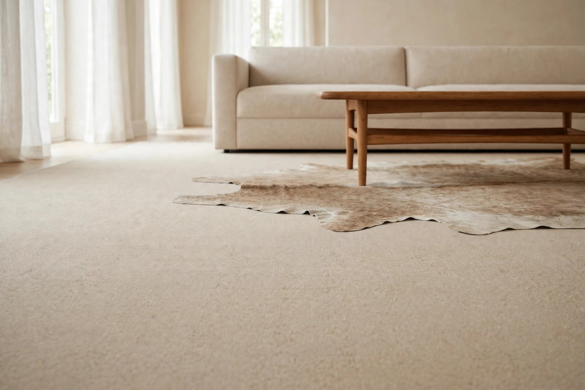
Layering lets you test print on the floor with almost no risk. Lay a large plain beige rug first, then place a small faded hide look rug off center under one side of the coffee table.
Choose a printed layer in washed beige, stone, and light brown, with soft edges and no dark patches. From the sofa, you should notice a gentle shift in tone before you notice any pattern.
Roll the small rug up for a week if the room feels restless. Most people find the layered corner grows on them, and crumbs show less on the mottled layer than on plain pile.
Keep the coffee table partly on the plain rug, so your eye crosses from plain to print in small steps.
9. Hang One Small Framed Print Above the Sofa

Wall art is the lowest contact way to try this look. One small framed piece with a faint animal print pattern, in beige and brown ink on cream paper, adds interest with no fabric at all.
Hang it off center above the sofa, or as the smallest piece in a plain art group. A thin wood frame ties it to the room better than a black frame, which sharpens the contrast.
Keep the rest of the wall plain. A single small print at eye level is easy to swap out in minutes, and holes stay covered if you reuse the same hook and frame size.
Swap the art seasonally if you like. The same frame can hold a plain sketch in summer and the print in fall.
10. Style One Print Box or Tray on the Shelves
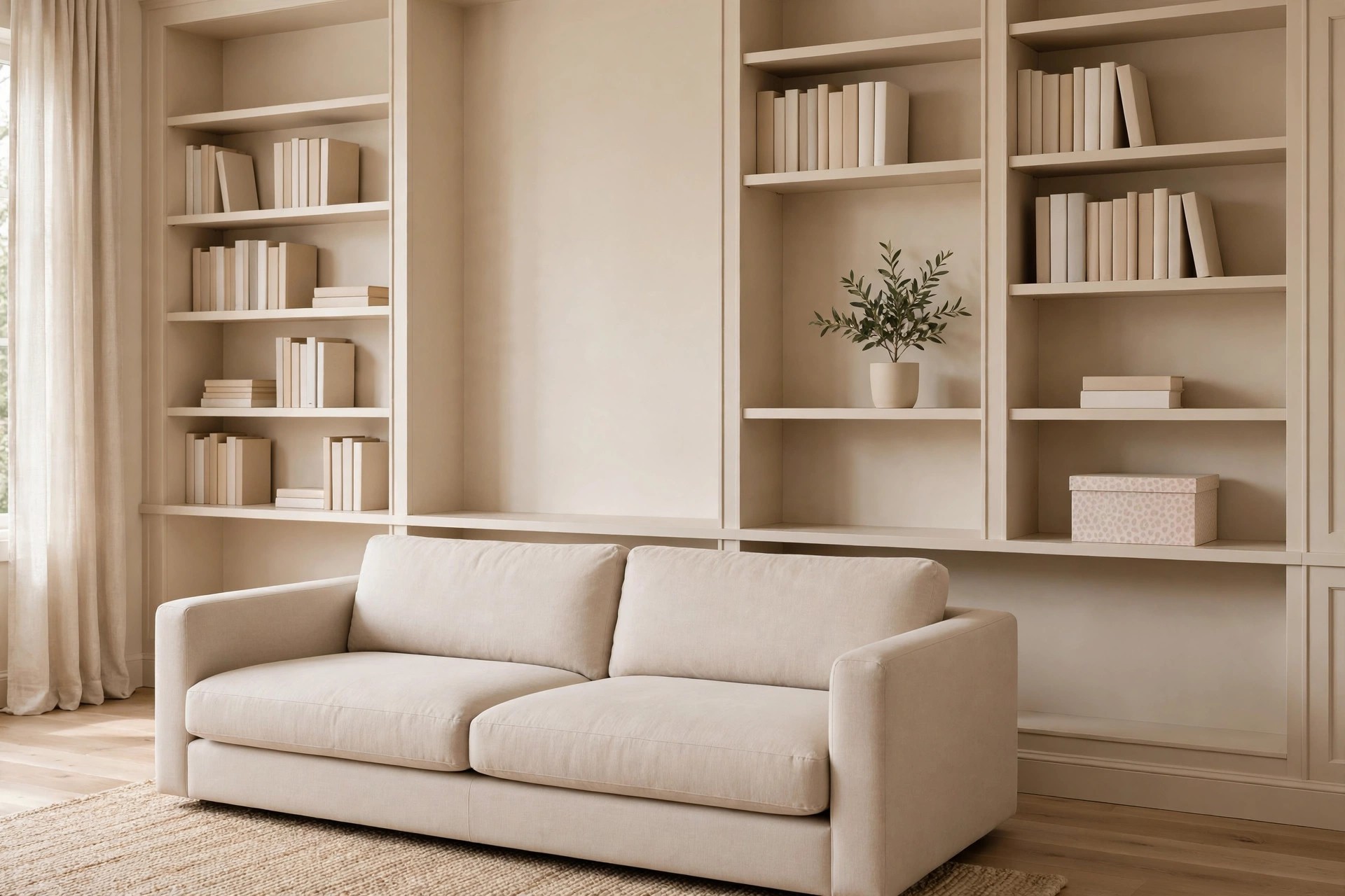
A small storage box or tray with a soft spotted finish can carry the print up onto shelving, where it reads as a detail rather than a theme. Keep the print pale and the shape simple.
Set it on one shelf with plain books and a small plant beside it, and leave the shelves above and below free of print. Our guide to beige living rooms with built in shelf styling covers that plain shelf balance well.
Use the box for remotes or coasters, so it earns its place. Decor that also stores daily clutter stays styled longer, because you put it back in the same spot each night.
Avoid glass tops here if the room is bright. Hard shine next to soft print makes the print look stronger than it is.
11. Put Print Only on the Back Cushion of One Chair
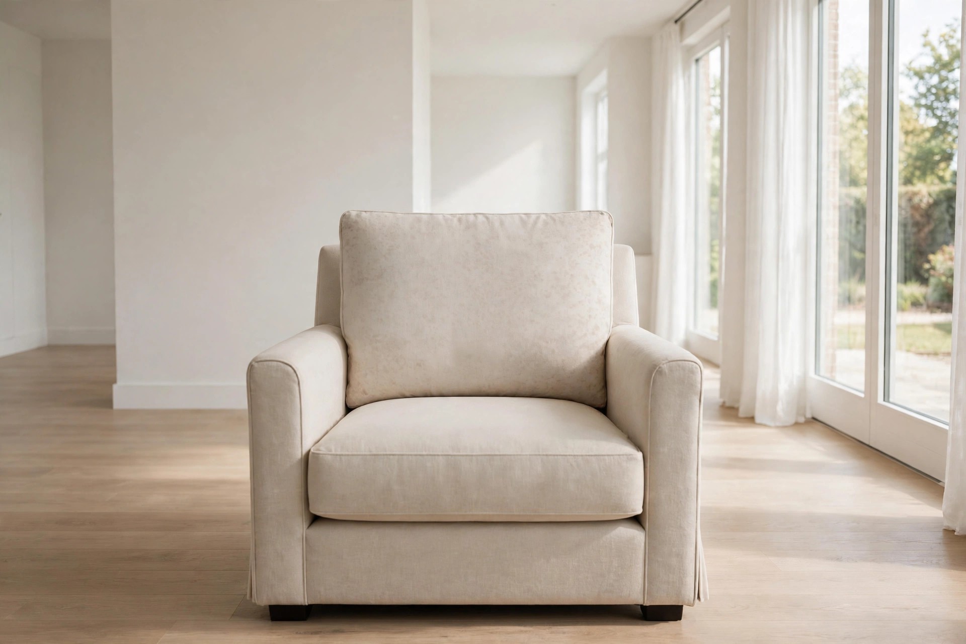
Some chairs let you swap a single cushion cover, and the back cushion is the best one to change. It shows from the doorway, yet it covers far less area than a full printed chair.
Pick a soft, broken spot print in beige and cocoa, and keep the seat cushion and chair frame plain. From behind, the chair looks plain. From the front, you get one gentle panel of pattern.
This split view helps in open rooms, where a chair back faces the kitchen or hall. The print greets one side only, so the other side of the space stays fully calm and plain.
Check the chair from the side too. A print that wraps around the cushion edge can look busier than one kept flat.
12. Fold a Throw So Only the Printed End Shows
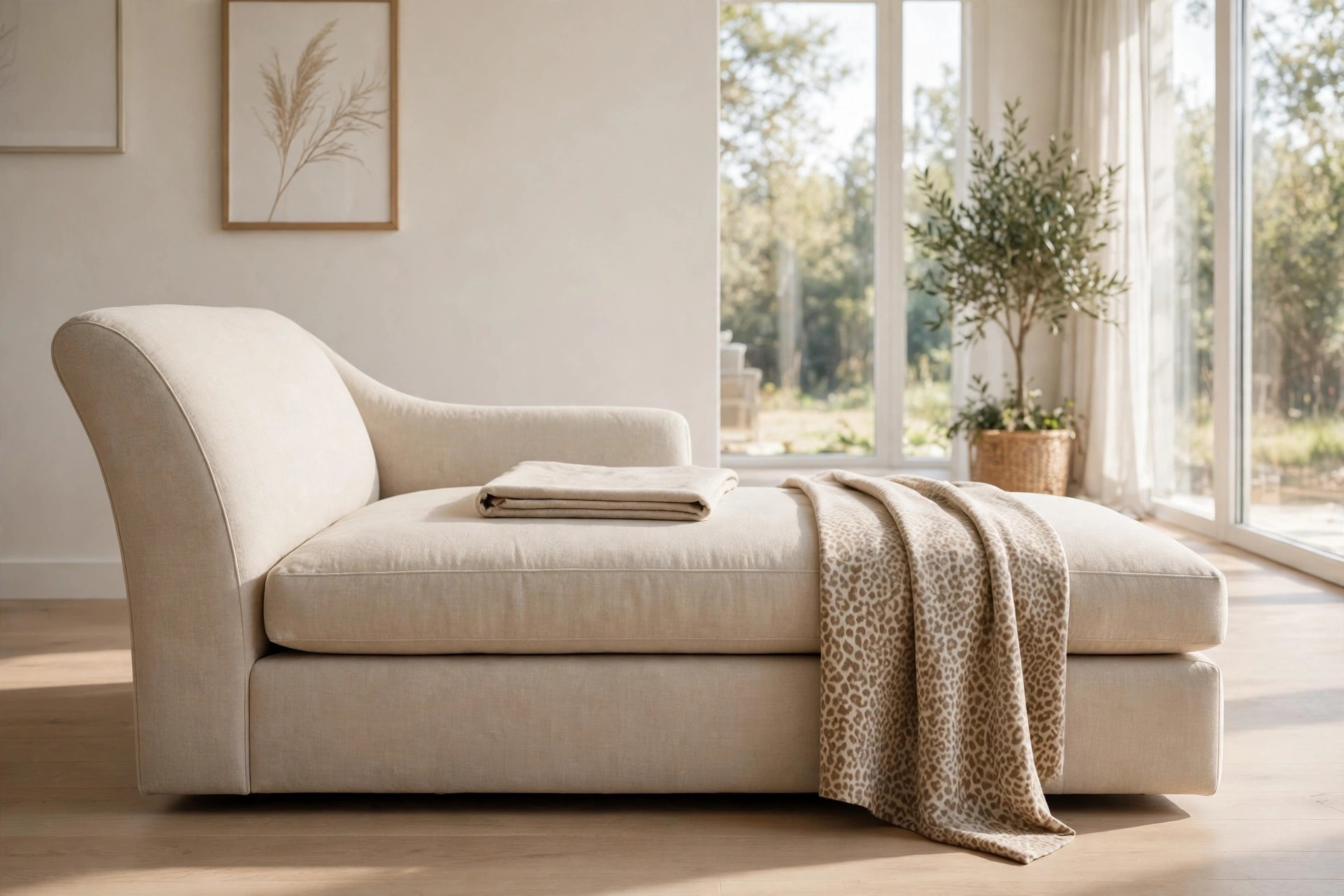
A double sided throw gives you two looks for the price of one spot in the room. Solid beige on one side, soft animal print on the other, folded so only a hand width of print shows.
Drape it over the end of a chaise or across the foot of the sofa seat, print end hanging down at the front. The solid fold on top keeps the overall read calm and tidy.
On movie nights the throw gets pulled and turned, and the print shows more. That is fine. The next morning, a ten second fold puts the room back to its quiet daytime setting.
Store it folded print side in when guests include small kids. Sticky hands find the pale end first, every single time.
13. Try a Lampshade With a Faint Print Inside
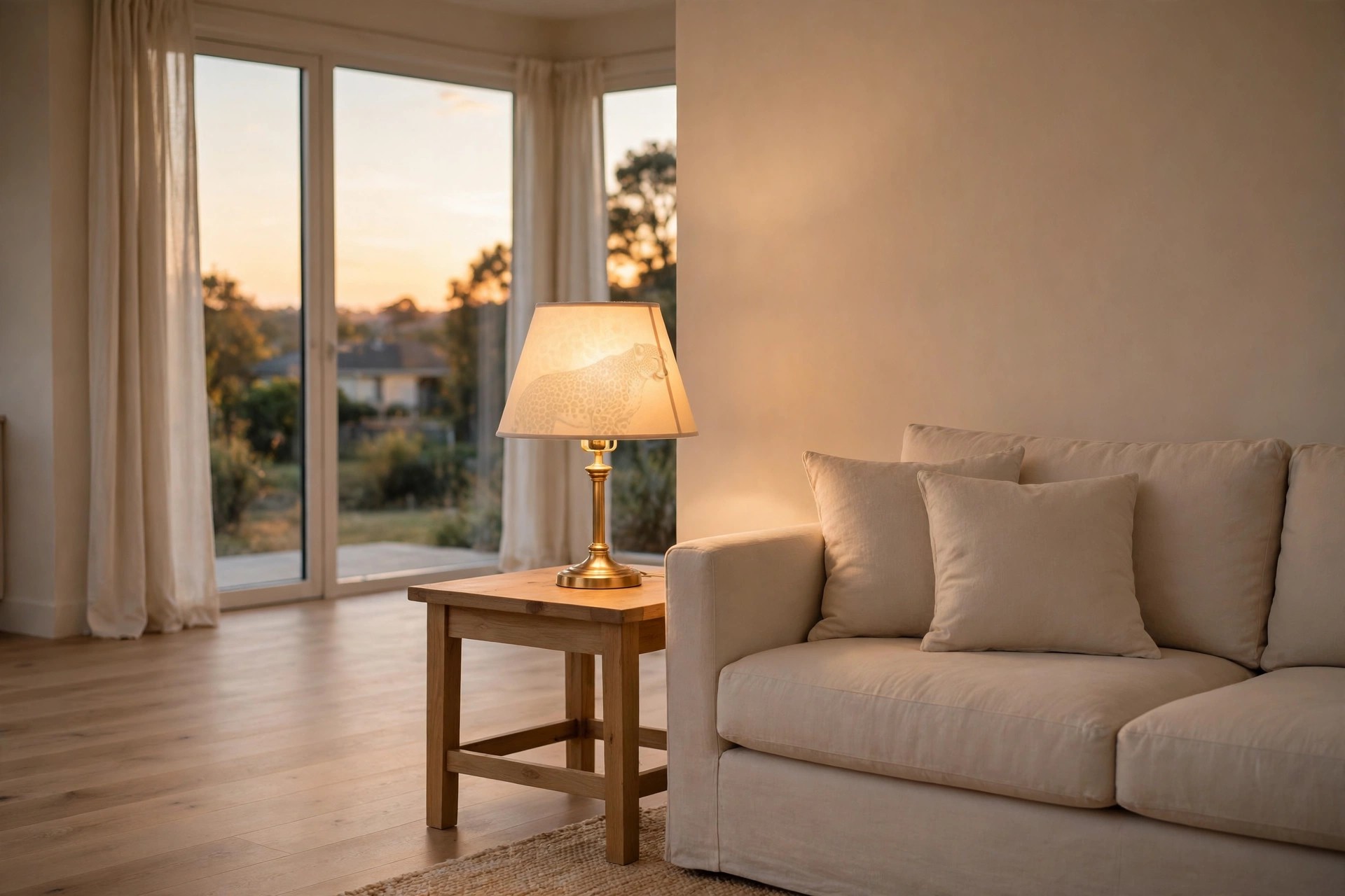
A plain shade with a faint animal print lining is the quietest print in this whole list. By day, the shade looks solid cream. At night, the warm bulb glows through and the soft pattern appears.
Use it on one table lamp beside the sofa, and keep any second lamp fully plain. Two glowing print shades in one room feel like a matched set, and matched sets read louder than singles.
Warm bulbs suit this trick best. Cool white light turns beige prints grey and a bit flat, while warm light keeps the spots golden and close to the tones of the sofa fabric.
Dust the shade lining gently each month. Dust dulls the glow and makes the faint pattern look grey rather than warm.
14. Surround One Print With Boucle, Linen, and Wool
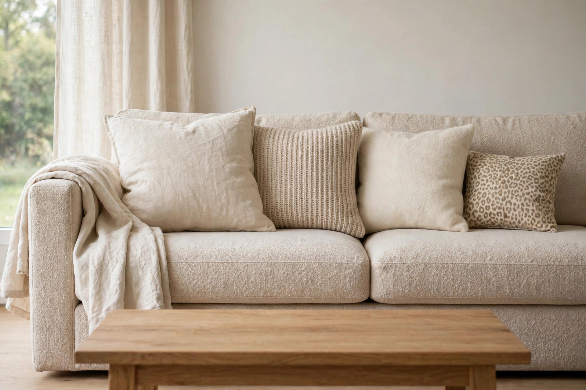
Plain texture is what makes a small print feel at home in a beige room. Boucle, washed linen, and a nubby wool throw all add interest without any pattern, so the one print never has to compete.
Build the sofa with those three plains first, then add a single soft print cushion last. Our cozy rustic living room ideas show how plain texture alone can carry a calm, layered seat.
Run a hand test before guests arrive. If every surface feels the same, swap one plain cushion cover for a rougher weave. Texture contrast, not more print, is what the seat needs.
If the room still feels flat, add wood tone or a plant next. Green leaves calm print better than a second pattern does.
15. Tuck a Small Print Stool Under the Console
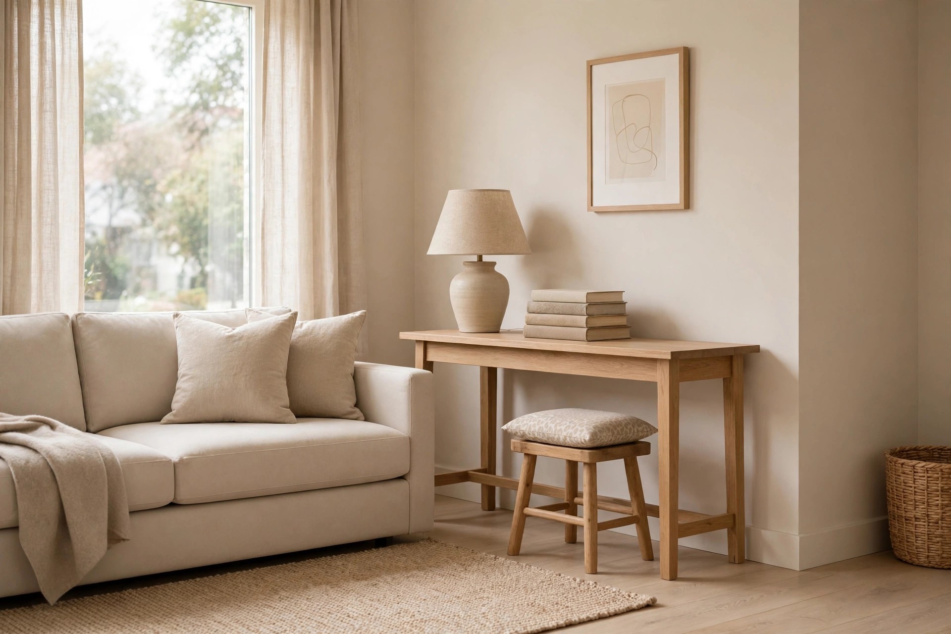
The edge of the room is a smart place for the last idea. A small stool or bench cushion in a pale, soft print, tucked under a console table, shows only from certain angles.
Pull it out for extra seating when guests come, then slide it back under when the room resets. In its tucked spot, just the front edge of the print shows, like a quiet hint.
Keep the console top plain, with a lamp, a stack of books, and one bowl at most. A busy top plus a printed stool below it is the one pairing that tips this idea loud.
From the sofa, that hint is enough. You get pattern at the edge of sight, never in the center of the room.
Start with the smallest idea that caught your eye, live with it for a week, and add a second print only if the room still feels plain. One print per view is a kind rule, and it keeps every choice easy to undo.
Done this way, beige living room ideas with subtle animal print accents stay calm, warm, and personal, with pattern as a quiet detail rather than a theme. Save this list to your beige living room board for later, and try one small print this weekend.


