

15 Bedroom Wall Art Ideas With Sconce Lighting Pairs
From the bed, a plain print can look flat and a bit lost. Add a sconce on each side and the same print suddenly reads as the center of the wall. The glow gives the frame edges, and the wall stops looking bare.
These bedroom wall art ideas with sconce lighting pairs treat the art and the lights as one unit. You pick the print, the spacing, and the light together, not one by one. That one change keeps the whole wall in balance.
Each idea below gives a clear pairing to copy. Some flank one wide print. Some set lights above, below, or between frames. All stay at the styling level, with no wiring talk at all. Each one suits a different wall in the room.
For light methods on their own, see our guide to ways to light bedroom wall art without an electrician. Here, the focus stays on how the pair frames the art itself. That split keeps both guides clear and simple to use.
This post contains affiliate links. If you buy through them, we may earn a small commission at no extra cost to you. See our Affiliate Disclosure.
1. Classic Bedroom Wall Art Ideas With Sconce Lighting Pairs Above the Bed
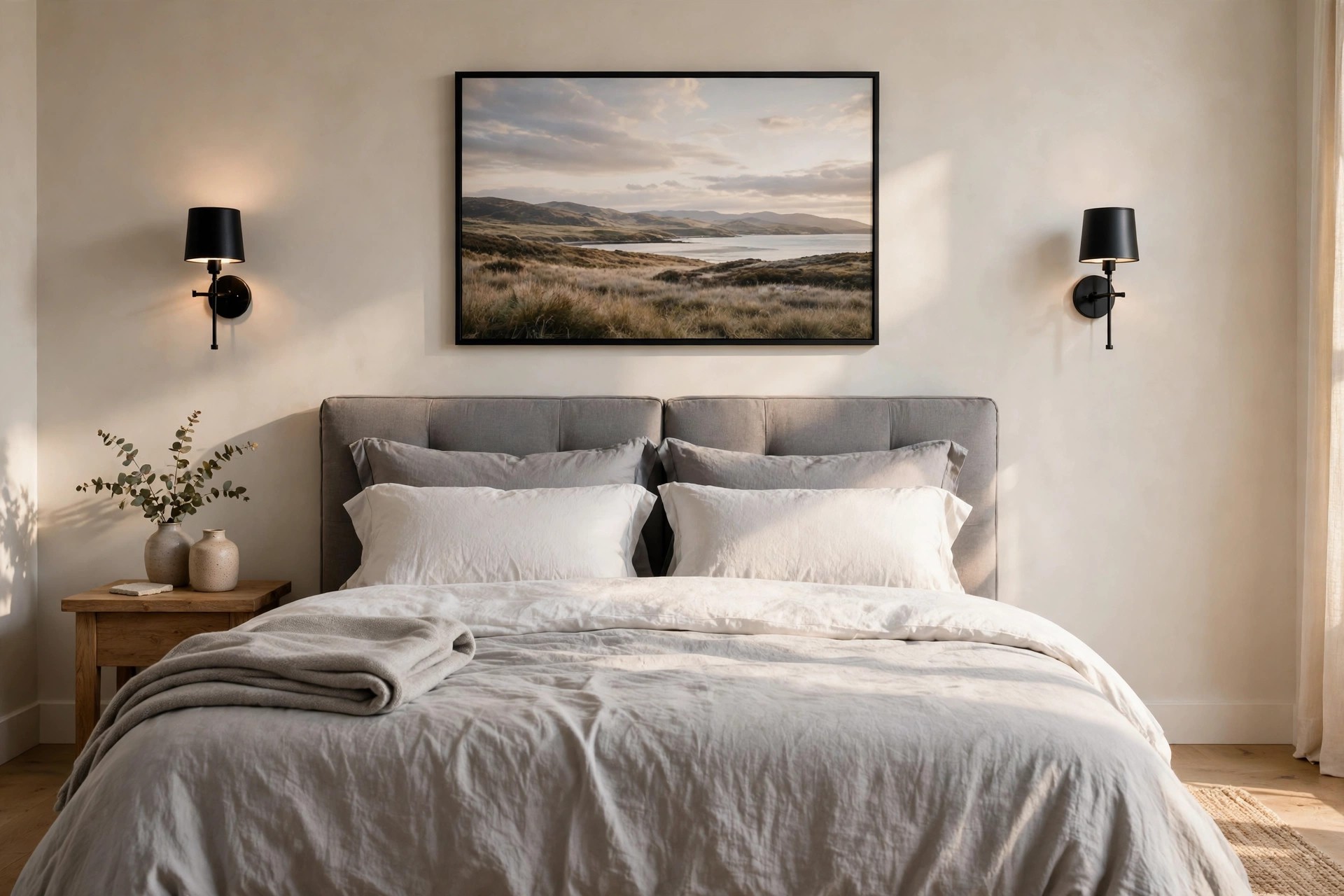
Hang one wide landscape print centered above the headboard. Leave a hand width of wall between the frame edge and each sconce. The three pieces then read as one wide unit from the door. This is the safest first pairing to try.
Keep the sconce centers level with the top third of the frame. Light falls across the print, not down onto the pillows. From the bed, the art stays clear with no bright spot in your eyes. Warm light suits wood frames best here.
A thin wood or black frame suits most beds here. Wide art needs a calm frame, since the sconces add the detail. Check the view from both pillows before you fix the last screw. That last check saves a lopsided look.
2. Set Two Matching Prints Inside One Pair of Sconces

Hang two matching prints side by side above the bed or a bench. Place one sconce outside each print, past the outer frame edges. The lights hold the pair together like bookends. It suits prints that feel too small on their own.
Keep the gap between the two frames small, about two fingers wide. A wide gap breaks the pair apart. Our guide to two-piece wall art ideas above the bed covers pair spacing in full. That rule holds for any pair size.
Match the sconce finish to the frame finish for a calm look. Brass with warm wood reads soft. Black with black frames reads sharp. Pick one mood and keep it across all four pieces. The pillows below can carry the color.
3. Run Slim Picture Lights Above a Row of Three Frames

A row of three same size frames looks smart with a slim light bar above each one. The bars sit close to the frame tops, like picture lights in a small gallery at home. Keep the bars the same width as the frames.
Line the frame tops up first, then set each bar dead center above its frame. A bar off center shows at once from the bed. Even spacing matters more than the art inside here. Step back and check all three at once.
This setup suits line drawings, soft photos, and pale prints best. Dark art can drink the light and look dull. Pale art glows and the wall feels warm in the evening. It suits a long side wall well.
4. Place the Sconces Below a Large Canvas Above the Dresser
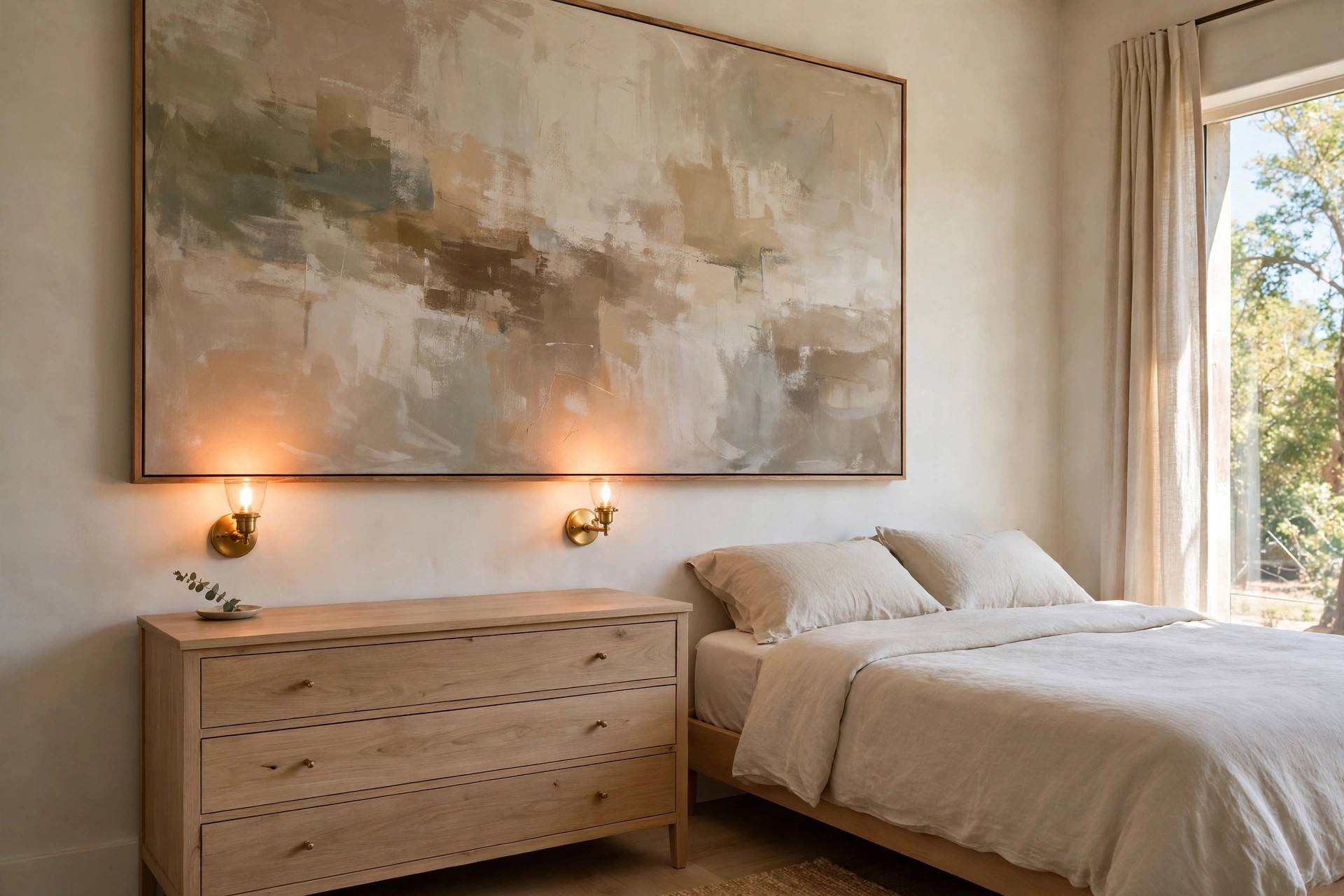
Most pairs sit beside or above art. This one sits below it. Hang a large canvas above the dresser, then set the sconces low on each side, just above the dresser top. The light climbs up the canvas.
Low light softens the bottom half of the art and leaves the top calm. It also lights the dresser top, where you fold clothes and set down a watch at night. Nothing bright sits at eye level here. It feels calm, like late day light.
Leave clear space on the dresser below each sconce. A stack of books on one side is fine. Tall bottles block the glow and crowd the base. Keep both ends of the dresser low and clear. The unit then looks planned, not packed.
5. Pair Tall Narrow Art With Slim Vertical Sconces
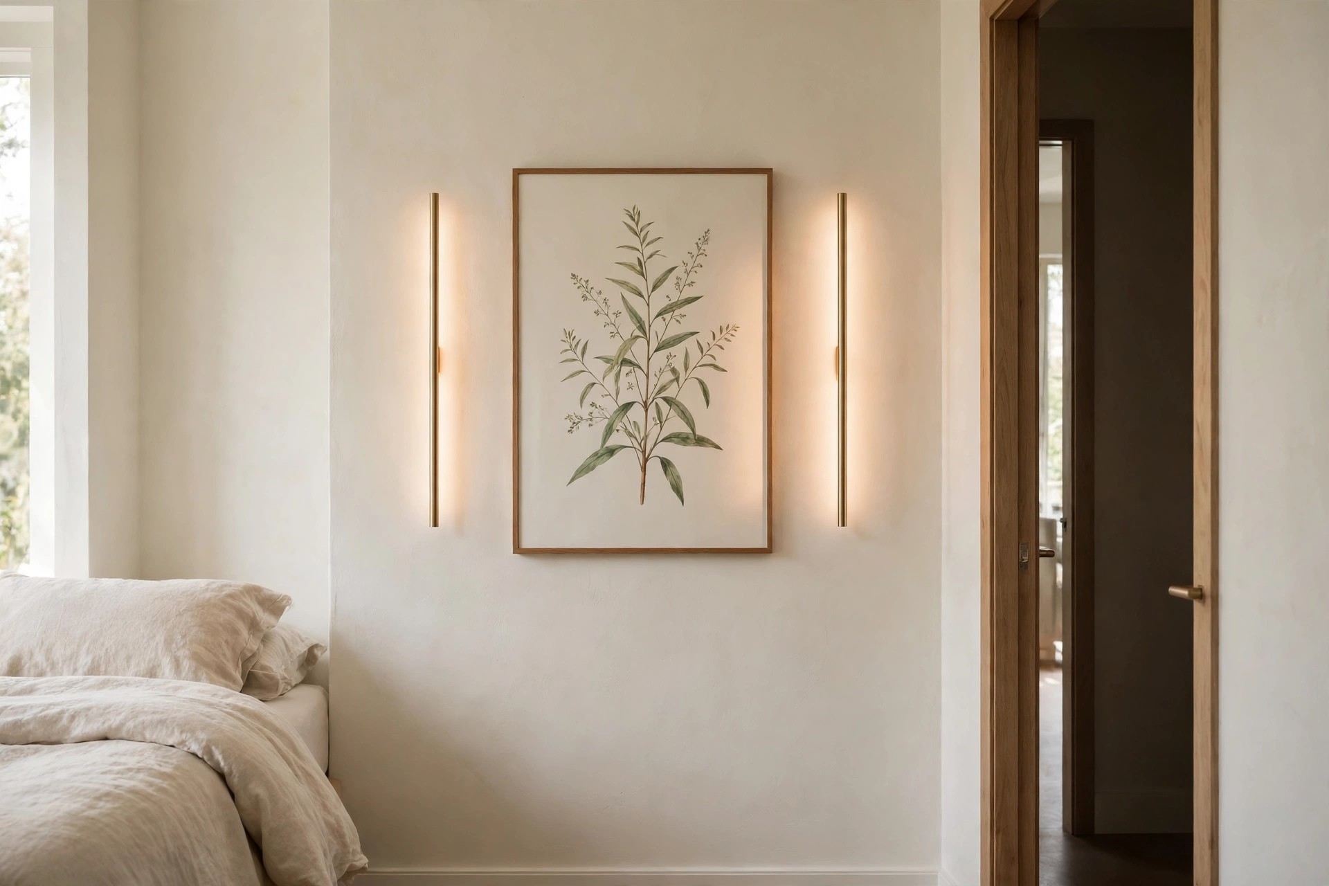
A tall, narrow print suits the short wall beside a door or a closet. Pair it with slim vertical sconces that echo its long shape. The whole unit stays neat on a tight wall. Nothing spreads sideways into the walkway.
Set one sconce on each side of the print, close to the frame. Their long lines draw the eye up and make the ceiling feel a bit taller from the bed. Short, wide sconces fight the shape here.
Pick art with a clear top and bottom, like a tall plant study or a long landscape turned upright. Busy art in a narrow frame looks squeezed. One calm image reads best at this width. A pale mat helps the art breathe.
6. Frame a Whole Gallery Group With Two Outer Sconces

A small gallery group can float on a wall and look lost. Two sconces set just outside the group fix that. They mark the left and right edges, so the group reads as one piece. The frames inside can stay mixed.
Build the group first and live with it for a day. Our bedroom gallery wall ideas guide helps with the layout. Then set the sconces level with the center of the whole group. Take your time with this step.
Keep the outer frames a few inches clear of each sconce. Crowded edges cast hard shadows on the nearest prints. A small gap keeps the glow soft across the group at night. Check the shadows after dark, not at noon.
7. Match Round Art With Soft Globe Sconces on Each Side

Round art softens a wall of straight lines and square frames. Flank one round print or a round framed piece with globe sconces. The three round shapes sit well together above a bed or a low chest. The wall feels calm at once.
Set the globe centers level with the center of the round art. If the globes sit high, the group looks like it floats. Level centers keep the three shapes in one calm row. Measure from the floor, not the frame.
White or cream globes suit pale art best. Smoked glass suits deeper tones and moody prints. Keep the frame thin, since the round shape and the globes already give the wall plenty of detail. Less trim reads cleaner here.
8. Soften a Botanical Pair With Fabric Shade Sconces
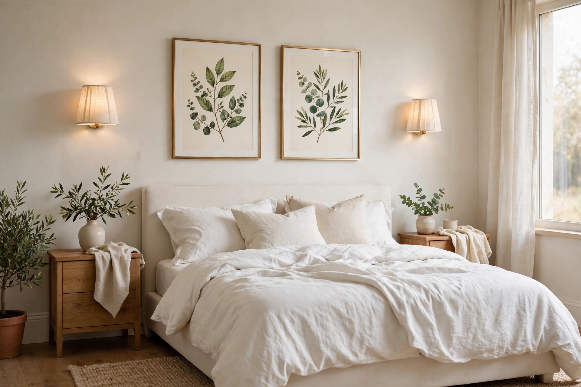
Fabric shades give the softest glow of any sconce style. Pair them with two botanical prints above the bed. The light falls gently and the leaf shapes stay clear, with no harsh shine on the glass. It is a kind pick for light sleepers.
Cream or white shades keep the greens in the art true. Yellow shades push the leaves toward brown by bedtime light. Hold a shade sample beside the print before you settle on the pair. Daylight tells the truth here.
Thin gold or wood frames warm up the soft look. Thick black frames feel hard next to fabric shades. If your bedding has a plant print too, keep it small so the wall stays the lead. The room then rests easy.
9. Sharpen Black and White Photos With Matte Black Sconces

Black and white photos need crisp light, not warm haze. Matte black sconces on each side of a photo pair keep the look sharp. The frames, the photos, and the lights share one tight palette. Nothing in the group fights for attention.
Set the sconces a bit closer to the frames than you would with color art. Close light lifts the gray tones in the prints. From across the room, the photos read clear and bold. Wide gaps make the pair look thin.
A white mat inside each frame keeps the photos from going flat. Skip cream mats here, since they yellow the look under warm light. This pairing suits city shots, family photos, and bare tree prints well. Keep the glass clean for best contrast.
10. Set Sconces Low Beside Wide Art Above a Low Bed

A low bed changes where the pair should sit. Hang wide art lower than usual, then set the sconces beside it at that same low line. The unit hugs the bed instead of floating above it. Tall placement looks lost on this wall.
Check the light from a lying spot, not standing up. Low sconces can glare at pillow height if they point out. Shades that face up or down keep the glow off your eyes at night. Tilt your head and test both sides.
Our guide to bedroom wall art ideas for a low platform bed covers low walls in full. Pair it with this low sconce line and the whole bed wall stays in scale, top to bottom.
11. Stack Two Small Prints and Center the Sconces Beside the Stack

Two small prints stacked one above the other make a tall, slim unit. Set the sconce pair beside the stack, level with the gap between the two frames. The light then serves both prints at once. It suits narrow walls well.
Keep the gap between the stacked frames small and even. A tall gap splits the stack into two lone prints. The sconces sit close, so the four pieces still read as one group. Measure the gap with a book spine.
Match the two prints by tone, not by subject. One dark and one pale print look top heavy in a stack. Two prints of like depth keep the column calm from top to bottom. Swap them once to test the balance.
12. Angle Swing Arm Sconces Toward Art Beside the Reading Side of the Bed
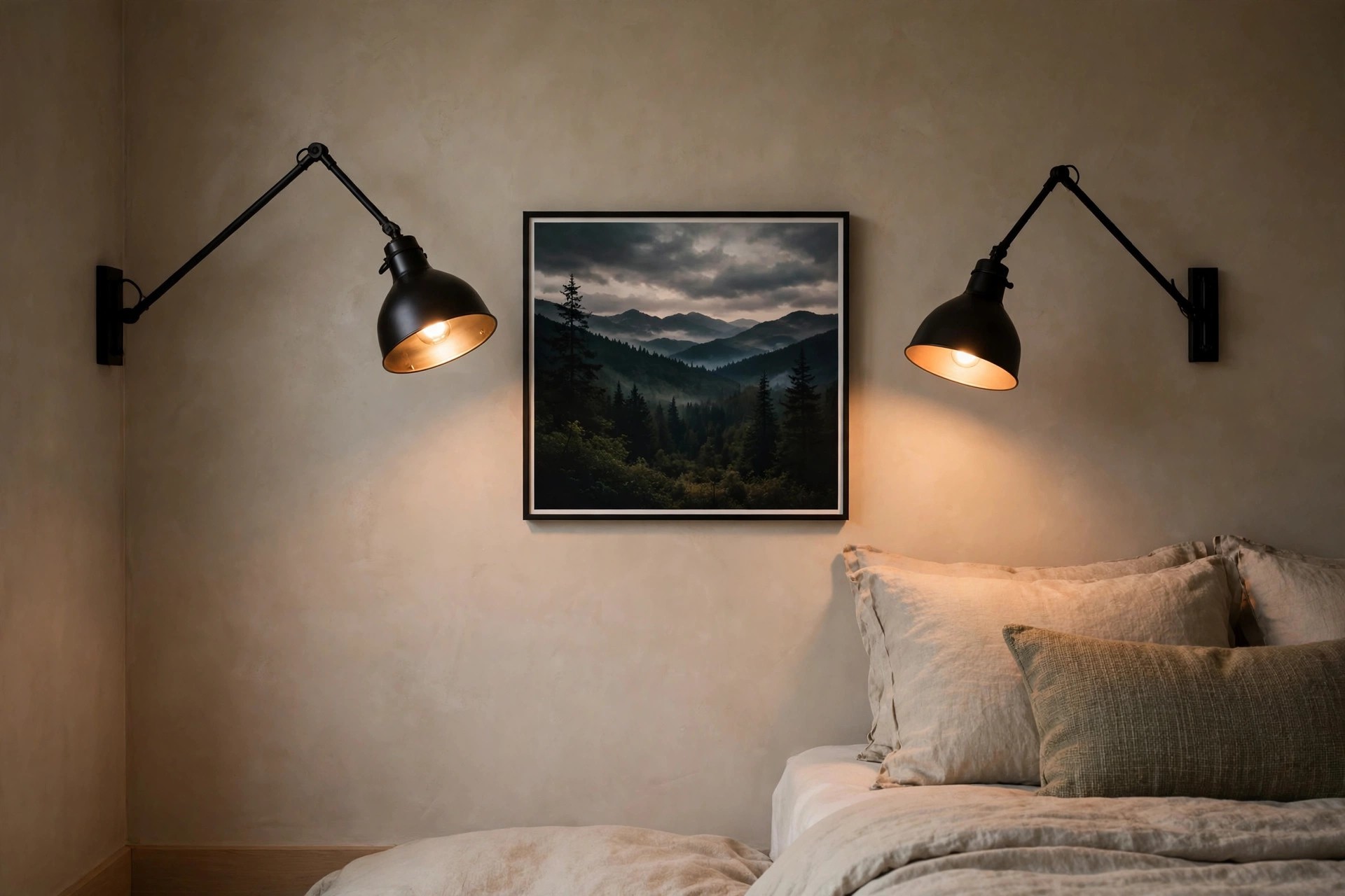
Swing arm sconces earn their keep beside a reading spot. Set a pair around one strong print near the bed. Angle each arm so the light tips toward the art and down toward the pillows. One pair does two jobs here.
Keep the print bold enough to hold the wall on its own. Fine, pale art fades next to strong metal arms. A deep landscape or a dark floral print stands up to the hardware well. Thin frames help the art stay in front.
For a chair spot, our guide to wall art ideas for a bedroom reading chair corner builds the whole corner. The same swing arm trick works there, with the art set just above the chair back.
13. Put the Sconce Pair in the Gaps Between Three Frames

Three frames in a row do not need lights at the ends. Set the sconce pair in the two gaps between the frames instead. Each sconce lights the frames on both sides of it. The row reads as one lit band.
This plan needs even gaps all the way across. If one gap is wide, its sconce looks lost in space. Tape the full row on the wall first and live with the marks for a day. Move tape, not screws, while you test.
Slim sconces suit the gaps best, since the space is tight. Wide shades crowd the frame edges and block part of the art. A plain bar or a small globe keeps the row neat and clear. Less bulk means fewer shadows.
14. Match Gold Frames With Warm Brass Sconces

Matching metals make a wall look planned in one step. Pair gold frames with brass sconces of a like tone. The art, the frames, and the lights share one warm note above the bed. Guest rooms wear this look well.
Test the tones side by side in day light first. Some brass reads orange next to pale gold frames. A clash shows more at night, when the warm glow pushes both tones further apart. Shop with a frame corner in hand.
Keep the art calm inside the gold frames. Soft landscapes and pale abstracts let the metal do the talking. Loud art plus gold plus brass is a lot for a wall you sleep under. Calm art keeps the room restful.
15. Keep Sconces Just Outside the Frame Edge on a Small Wall

Small walls need the pair pulled in tight. Set each sconce just outside the frame edge, with a gap you can span with one hand. Wide gaps on a small wall make the art look stranded. Tight spacing reads as one group.
One print, not two, suits this plan best. Two prints plus two sconces crowd a short wall fast. A single strong print with close sconces fills the wall without any sense of clutter. The bed below can stay plain.
Check the view from the doorway, where the wall shows first. If the sconces pull your eye off the art, move them an inch closer. The art should win the first look every time. Light should back the art, not beat it.
Start with the wall you see first from the bed. Pick one pairing above, set the spacing with tape, and live with it for a day before you commit.
Good bedroom wall art ideas with sconce lighting pairs come down to one rule. Treat the art and the lights as one unit, and size them to the wall they share.
Save this to your bedroom wall art ideas board for later. When you shop, take the wall width and the frame size with you, and the right pair is much easier to spot.


