
15 Blue and Red Kitchen Designs That Prove Opposites Really Do Attract
There’s a reason designers keep coming back to blue and red. On paper, it sounds like a bold gamble — one color pulls cool and calm, the other pushes warm and energetic. But in a kitchen, that tension is exactly the point. The blue settles the room down, the red gives it a pulse, and together they create a space that feels curated rather than accidental. It’s the kind of pairing that photographs beautifully in the morning light over coffee and still feels rich and grounded during a Sunday dinner with the whole family crowded around the island.
This color combination has quietly become one of the most talked-about pairings in kitchen design for 2026, with designers noting a shift away from matchy-matchy palettes toward exactly this kind of “quiet contrast” — deep reds bringing richness, softer blues bringing dimension. Whether you’re drawn to a moody navy-and-burgundy statement or a breezy cornflower-and-brick-red cottage look, there’s a version of this pairing for every kitchen. Here are fifteen ways to bring it to life.
1. Navy Cabinets with a Burgundy Marble Island

Anchor the room in deep navy lower cabinets, then let a burgundy or oxblood marble island take center stage. The marble’s natural veining softens the red so it reads as sophisticated rather than loud, while the navy keeps everything else feeling restrained. Pair with brushed brass hardware and a simple white or cream countertop on the perimeter cabinets to let the island do the talking. This layout works especially well in larger kitchens where the island already functions as a natural focal point, and it photographs beautifully under a single statement pendant light.
2. Powder Blue Uppers, Brick Red Lowers

Flip the usual “dark on bottom” rule and instead split by color: soft powder blue upper cabinets paired with brick red lower cabinets. The lighter blue up top keeps the ceiling line feeling airy, while the red at counter height grounds the room and hides everyday scuffs better than a pale finish would. Finish with unlacquered brass pulls that will patina over time, and a butcher block or warm oak countertop to bridge the two colors with a neutral, natural material.
3. Charcoal Blue Cabinetry with Oxblood Accents

For a moodier, more dramatic take, go with charcoal blue — a slate-adjacent shade that reads almost neutral in low light but reveals its blue undertone in daylight — as the dominant cabinet color. Introduce red sparingly through an oxblood range hood, a painted pantry door, or a runner rug. This restrained approach lets the red function as a true accent rather than competing for attention, which suits kitchens that open directly into living or dining areas where you want a cohesive, grown-up palette.
4. English Country Kitchen in Refectory Red

Lean into heritage style with deep, traditionally painted red cabinetry inspired by English country house kitchens, then cool it down with a soft blue-gray island or a blue tile backsplash. Open shelving, brass plate racks, and a farmhouse sink complete the look. This combination feels collected over time rather than installed all at once, which makes it a great fit for older homes or anyone chasing that lived-in, multi-generational kitchen feel.
5. Cornflower Blue Cabinets with a Red Brick Backsplash

Pair cheerful cornflower or cerulean blue cabinets with an exposed or faux red brick backsplash for a look that splits the difference between coastal and industrial. The brick’s texture and slightly uneven tone keep the red from feeling too saturated, while the blue cabinetry brings in a playful, almost nautical energy. White countertops and stainless steel appliances keep the palette from feeling too busy, letting the two statement materials share the spotlight evenly.
6. Two-Tone Island: Blue Base, Red Top Cabinets

If a full red kitchen feels like too much, try a two-tone island instead — a deep blue cabinet base topped with a short run of red upper cabinets or open shelving, all in the same footprint. This gives you a contained “test drive” of the red-and-blue pairing without committing the whole room to it, and it turns the island into a genuine architectural moment rather than just a workspace. A waterfall countertop edge in white quartz ties the two colors together cleanly.
7. Slate Blue Walls with a Red Range Cooker

Sometimes the boldest move is the appliance itself. Paint the walls a warm, weathered slate blue and let a red range cooker or oven become the room’s centerpiece, surrounded by simple white or cream cabinetry. This approach is ideal for renters or anyone hesitant to paint cabinets permanently — the color commitment lives in a piece you can eventually swap out, while the blue wall color does the heavy lifting for atmosphere.
8. Coastal Kitchen with Sky Blue Cabinets and Coral-Red Stools

Take the pairing somewhere brighter and beachier with sky blue cabinetry, whitewashed wood floors, and a set of coral-red counter stools pulled up to the island. Woven pendant lights and brass fixtures add warmth without pulling the palette off course. This version trades the moodiness of navy-and-burgundy for something sunnier and more casual, and it’s particularly effective in kitchens with good natural light or a view toward water.
9. Deep Navy Perimeter with a Red Lacquered Island

Keep the surrounding cabinetry in a rich, matte navy and let a glossy, lacquered red island stand completely apart in both color and finish. The contrast in sheen — matte versus high-gloss — does as much work as the color contrast itself, giving the island a jewel-box quality. Gold or unlacquered brass hardware on the island specifically (even if the rest of the kitchen uses black or nickel) reinforces that it’s meant to be the star.
10. Blue Cabinets with a Red and White Checkerboard Floor

Ground playful blue cabinetry with a red and white checkerboard or diamond-pattern floor, either in tile or painted directly onto existing floorboards. This is a retro-leaning choice that works especially well in smaller, breakfast-nook-style kitchens where the floor pattern can be appreciated as a whole rather than broken up by a large island. Keep countertops and backsplash simple and white so the floor and cabinets remain the two clear focal points.
11. Mediterranean-Inspired Blue Mosaic with Terracotta-Red Tile
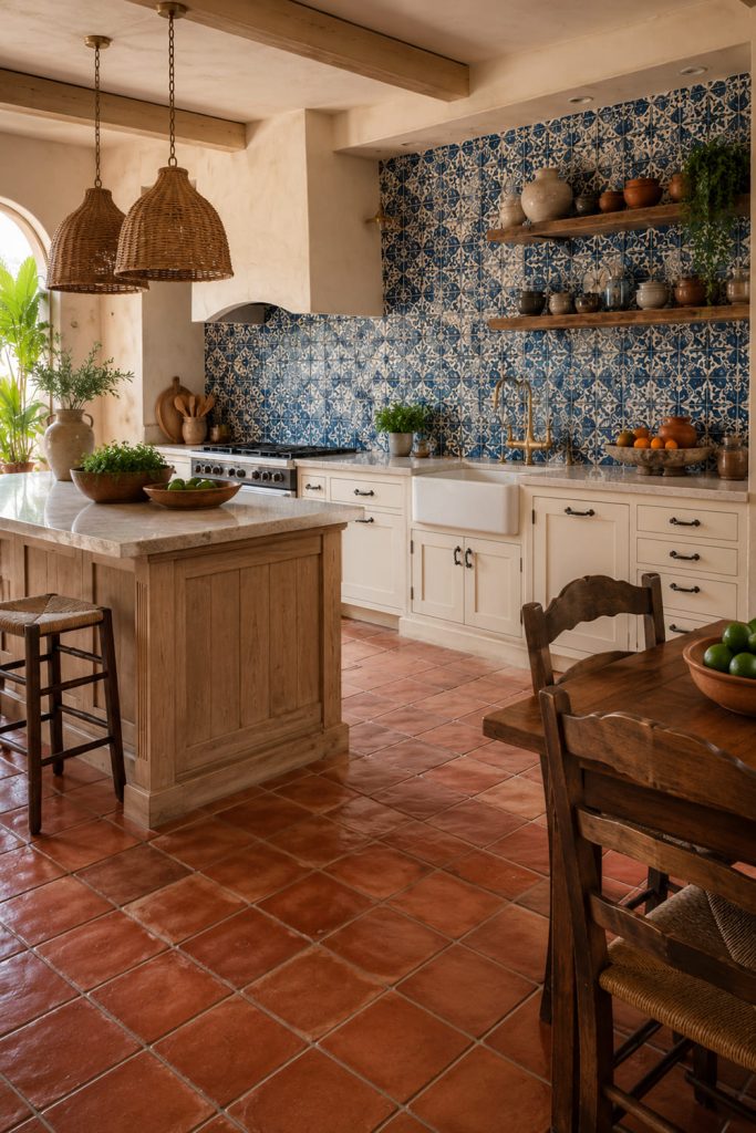
Combine a blue mosaic tile backsplash with terracotta or brick-red floor tile for a warm, sun-baked feel reminiscent of coastal Spain or Morocco. Cream or unfinished wood cabinetry keeps the two tile moments from competing, and simple black iron hardware adds just enough contrast. This design leans more textural than color-blocked, which makes it a good option for anyone who wants the blue-and-red effect without large expanses of solid color.
12. Burgundy Cabinets with Pale Blue Walls

Reverse the usual ratio and make red the dominant cabinet color, using a soft, pale blue on the walls as the supporting player. Burgundy or oxblood lower cabinets paired with open shelving and a pale blue wall behind them create a layered, gallery-like effect, especially when the shelving displays white or cream dishware. This works well in kitchens with strong architectural bones — exposed beams, vintage windows — that can stand up to a darker, richer cabinet tone.
13. Modern Minimalist Kitchen with Navy Base Cabinets and a Red Accent Wall

Keep cabinetry simple and streamlined — flat-panel navy base cabinets, no uppers, just open space and a hood — and let a single red accent wall or red-tiled niche behind the range provide the contrast. This is the most restrained version of the pairing, ideal for open-plan or galley kitchens where too much pattern or color would feel cramped. Matte black fixtures and a plain quartz countertop keep the overall look architectural and calm.
14. Vintage-Inspired Kitchen with Sky Blue Cabinets and Cherry-Red Diner Stools

Channel a retro diner mood with sky blue cabinets, chrome hardware, and a couple of cherry-red vinyl stools at a small peninsula or breakfast bar. Black-and-white checkerboard floor tile or a simple red-and-white striped runner rug completes the throwback feel. This is a particularly good fit for family kitchens that want to feel fun and approachable rather than showroom-formal, and it’s an easy palette to update seasonally with small textiles.
15. Farmhouse Kitchen with Blue-Gray Cabinets and a Red Brick Backsplash

Close out with a warm, farmhouse-leaning version: chalky blue-gray cabinets, a red brick or brick-look backsplash behind the range, and warm wood open shelving in between. A farmhouse sink, woven light fixtures, and brass or oil-rubbed bronze hardware round out the look. This combination has real staying power because both the blue-gray and the red brick are weathered, muted tones rather than saturated ones, so the kitchen feels timeless rather than trend-driven.
Planning and Buying Guide: How to Get the Blue-and-Red Balance Right
Pick your dominant color first. Blue-and-red kitchens work best when one color leads and the other supports — roughly an 80/20 or 70/30 split. Decide whether you want a blue kitchen with red accents or a red kitchen with blue accents before you start sourcing paint chips or cabinet finishes; trying to run both colors at 50/50 usually reads as busy rather than intentional.
Choose muted or “dirty” shades over primary tones. The 2026 designer take on this pairing leans on chalky, weathered blues (slate blue, blue-gray, charcoal blue) and deep, wine-adjacent reds (burgundy, oxblood, brick) rather than bright primary blue and fire-engine red. Muted tones feel sophisticated and age well; saturated primaries can feel more like a themed room than a finished kitchen.
Let one material carry the contrast. You don’t need both colors in cabinetry. A blue cabinet base with a red island, a blue kitchen with a red backsplash, or a red kitchen with blue walls all achieve the same visual tension with far less risk. This also makes the design easier — and cheaper — to update later if your taste shifts.
Use neutral countertops and floors as a buffer. White, cream, or warm wood countertops and flooring give the eye somewhere to rest between the two bold colors. Avoid pairing patterned countertops with this scheme; the blue and red are already doing the pattern’s job.
Warm up your metals. Brass, unlacquered brass, and warm brushed gold hardware tend to flatter both blue and red better than cool chrome or stainless, especially in the muted, heritage-leaning shades that are trending for 2026. If you prefer a more modern, minimal look, matte black is the next-best neutral choice.
Test both colors in your actual lighting. Blue and red both shift dramatically under warm versus cool lighting and natural versus artificial light. Paint large sample boards of both colors and view them at different times of day before committing to cabinetry, which is a far bigger investment than a wall color.
Budget for the accent piece, not just paint. If you’re working with a smaller budget, concentrate your red (or blue) investment in one high-impact, lower-cost element — a range cooker, an island, a backsplash, or stools — rather than spreading the color thin across every surface.
Final Thoughts
Blue and red might not be the first pairing that comes to mind for a kitchen, but that’s exactly what makes it feel fresh. Done with restraint — one dominant color, one considered accent, and warm neutral materials in between — it creates a kitchen with genuine depth and personality instead of a matched showroom set. Whether your style leans coastal, farmhouse, English country, or modern minimalist, there’s a version of this palette that will feel like it belongs in your home for years, not just for a season.


