
15 Bathroom Paint Colors for a Bathroom With No Windows
A bathroom with no windows asks more of its paint than any other room in the house. There is no daylight to soften a harsh shade, no view to distract from a colour that has gone slightly wrong, and nowhere for steam and shadows to hide. Switch the light on at seven in the morning or ten at night and the walls have to perform exactly the same way, under bulbs you chose, every single time.
That sounds like a limitation, but it is quietly an advantage. Because the light never changes, a windowless bathroom is the most predictable room you will ever decorate. Choose a colour that loves artificial light, test it properly under your own fittings, and it will look right on a grey Monday and a bright Saturday alike. If you are still weighing up colour families in general, these small bathroom colour ideas are a useful place to start before you narrow down to paint.
Below are fifteen bathroom paint colours for a bathroom with no windows, from warm whites that refuse to look dingy to deep navy and emerald schemes that lean into the darkness on purpose. Every one has been chosen for how it behaves under ceiling and mirror lights rather than in a sunlit showroom, because that is the only test that matters here.
How to Choose Paint Colour for a Bathroom With No Windows
Judge colour by undertone, never by the name on the tin. Paint names promise things like “morning mist” or “pure snow”, but what actually decides how a colour behaves is the quiet base underneath it — warm yellow, pink, green or cool blue. In a windowless room that undertone is amplified by artificial light, so a white with a blue base can turn faintly icy and a grey with a green base can suddenly look like sage. Hold swatches against something you know is truly neutral, like a sheet of plain white paper, and the undertone usually reveals itself within seconds.
Test the shade where it will live, and test it in the evening. Paint a generous patch — bigger than you think necessary, ideally on two walls that meet at a corner — then live with it for a day and check it under your own bulbs at night, because evening is when a windowless bathroom works hardest. Bulb temperature matters just as much as the paint itself: warm bulbs flatter warm colours and soften everything, while cool daylight-style bulbs can make gentle shades look stark. Getting your small bathroom lighting ideas settled before the final colour decision saves repainting later, and the same warm, layered approach also suits an accessible bathroom planned for elderly parents, where clear, flattering light matters even more.
Finally, think about finish as well as colour. A windowless bathroom holds steam longer because there is no window to throw open, so the paint has to cope with condensation settling on it daily. Satin and eggshell finishes cope with that steam far better than flat matt — they shrug off moisture, wipe clean without marking, and their gentle sheen bounces a little light around a room that has none to spare. Save dead-flat finishes for ceilings if you love them, and let the walls do some quiet reflecting.
1. Warm White That Never Turns Dingy
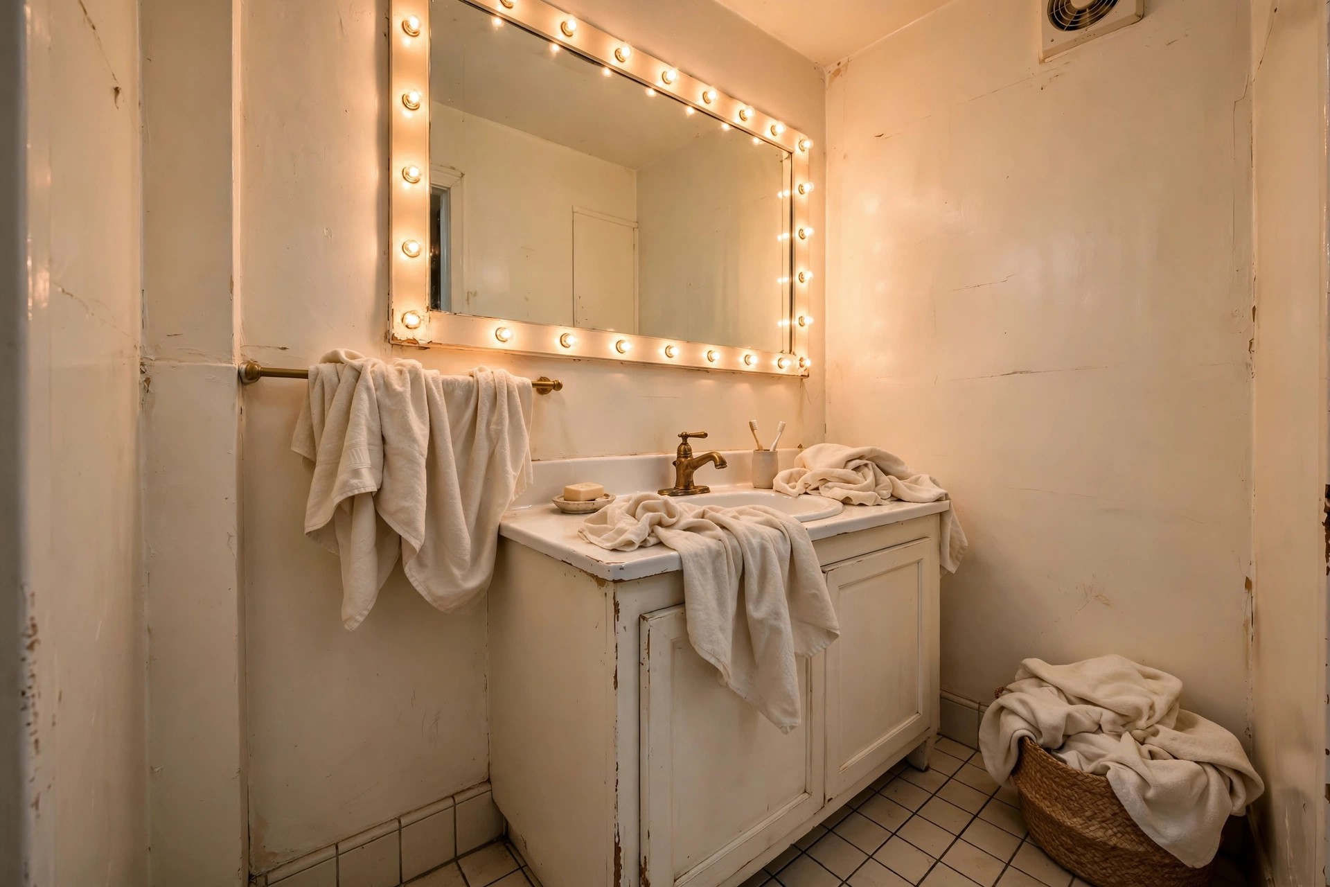
Warm white is the safest starting point for a bathroom with no windows, and the most misunderstood. The right warm white carries a whisper of yellow or creamy beige in its base, which is exactly what artificial light rewards — the walls read clean and bright without ever tipping into that grey, slightly dirty look that cooler whites develop away from daylight. Keep tiles, sanitaryware and towels in the same warm family so nothing fights, and let texture do the decorating: fluted wood, a woven basket, brushed metal taps. Avoid layering several different whites together, because under bulbs their undertones separate and one of them will always look grubby by comparison. One warm white, used generously and consistently, feels calm, expensive and permanently just-painted.
2. Pale Greige, the Peacemaker Neutral

Greige — that soft balance between grey and beige — earns its peacemaker nickname by getting along with almost everything already in your bathroom. Pure grey can turn cold under artificial light and pure beige can turn yellow, but greige holds the middle ground and stays composed beside chrome, black or warm wood fittings alike. It is a forgiving backdrop for the mixed finishes most real bathrooms end up with, and it hides the faint shadowiness of a windowless room better than brilliant white does. Choose a pale version so the room still feels light, then warm it further with natural textures: a wooden stool, a jute-look mat, towels in cream rather than stark white. Greige rarely excites anyone on a swatch card, yet it is the colour people live with happiest.
3. Soft Sage Green to Borrow the Outdoors
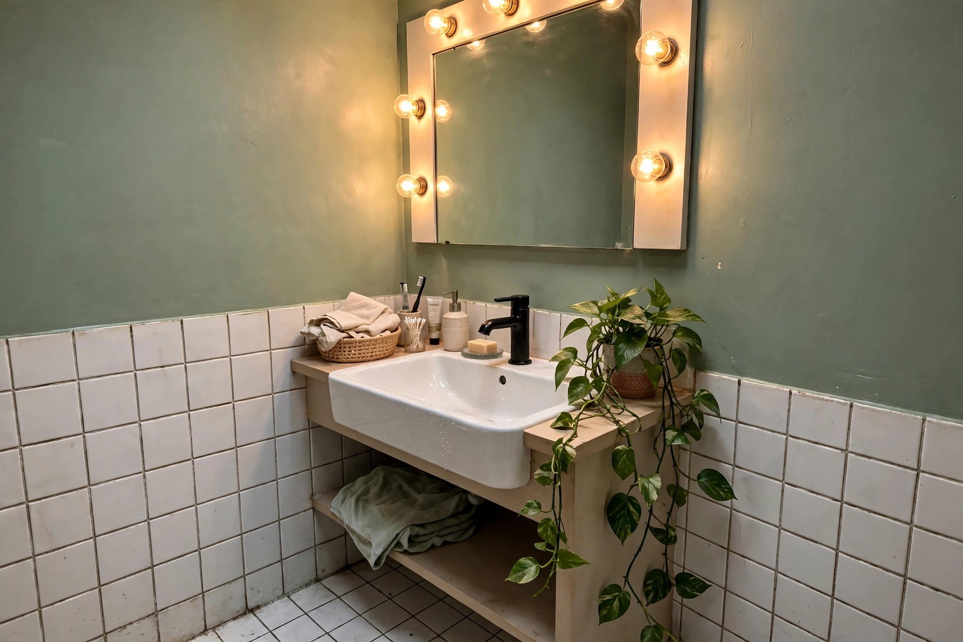
A windowless bathroom misses greenery most of all, and soft sage green answers that lack directly. Its greyed, muted base keeps it calm rather than sweet, and under warm bulbs it reads like the soft light of a garden in shade — fresh without a hint of coldness. Sage flatters white sanitaryware, loves unlacquered wood and stone, and pairs beautifully with black or brushed brass fittings depending on whether you want the room to feel modern or gently traditional. Because it has real colour to it, sage also disguises the flatness that artificial light can create, giving walls a sense of depth even in a small box of a room. Add one real or convincing trailing plant and the borrowed outdoors feels complete.
4. Powder Blue That Feels Like Daylight
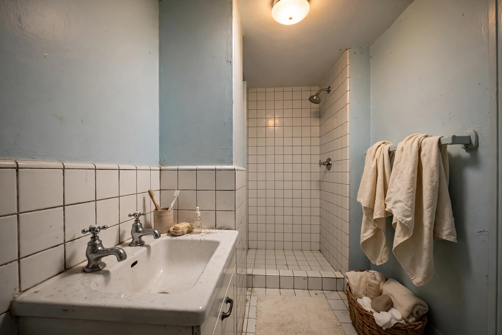
Powder blue is the closest paint comes to bottled daylight. Our eyes associate that pale, airy blue with open sky, so a room washed in it feels fresher and larger than its measurements — a useful trick where there is no actual sky on offer. The secret is choosing a powder blue with a soft, slightly greyed base rather than a bright icy one, and then warming the room around it: warm bulbs, cream towels, a touch of natural wood. Kept pale, it never feels cold, just clean in the way a coastal morning feels clean. Powder blue is especially kind in a morning bathroom, where its brightness makes early starts feel less like midnight. Pair it with white tiles and silver-toned fittings for a classic, breezy finish.
5. Blush Pink That Flatters Skin in the Mirror

Every colour on this list has to earn its place in front of a mirror, and blush pink earns it by being the most flattering shade you can put around a face. Its warm rosy base reflects a gentle glow back onto skin, softening tired mornings in a way no blue or grey ever will. Choose a muted, dusty blush rather than a sugary pastel — the grown-up versions carry a little brown or grey in the mix, which keeps them sophisticated under artificial light. Blush sits happily with marble-look tiles, warm metallics and deep green towels if you want contrast, and it turns a purely practical room into somewhere that feels considered. If you have ever wondered why some hotel bathrooms feel so kind, this is usually why.
6. Pale Lavender With a Grey Base
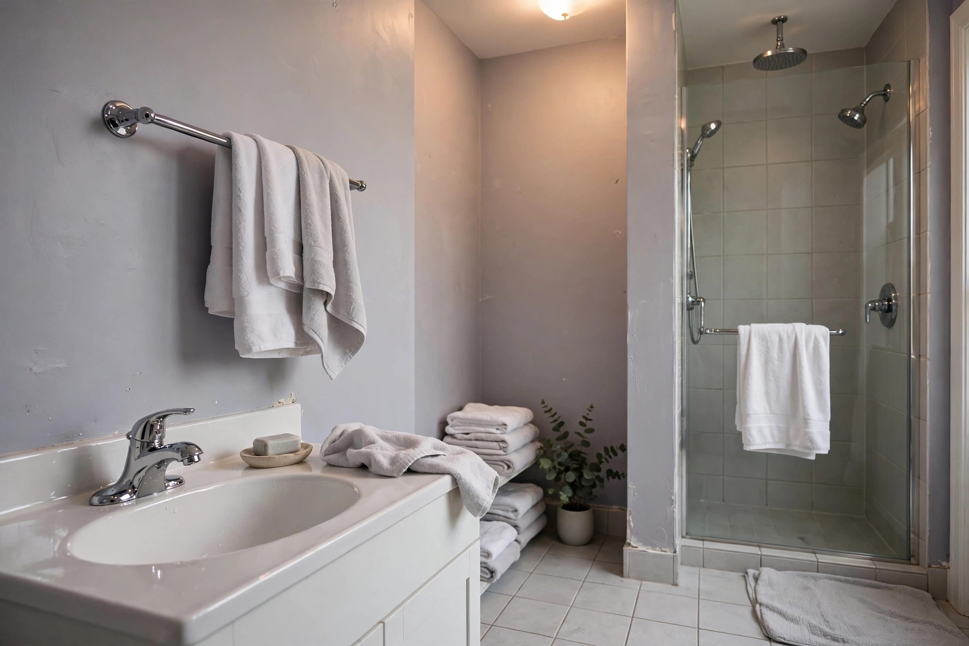
Lavender frightens people who remember sugary purple bedrooms, but pale lavender with a grey base is a very different colour — quiet, cool and faintly architectural. The grey reins in the purple so the walls read as a soft neutral with a lilac mood rather than a theme, and in a windowless bathroom that coolness can feel spa-like and restful, especially for evening baths. Keep the rest of the palette disciplined: white or pale grey tiles, simple chrome fittings, towels in white and soft grey, perhaps one deeper plum accessory to anchor the scheme. Lavender is also a graceful choice where the bathroom adjoins a bedroom in similar tones, letting the two rooms flow together without matching exactly.
7. Buttercream Yellow to Fake the Sunshine
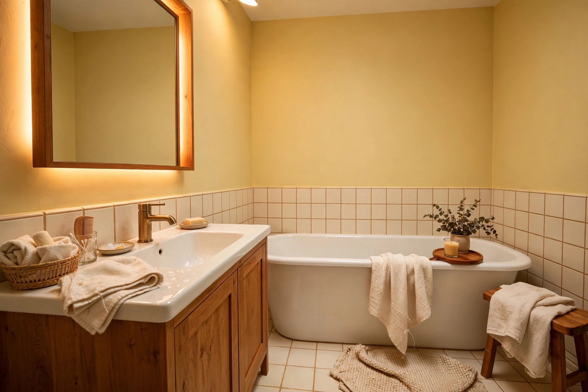
If any colour can stand in for a missing window, it is a soft buttercream yellow. Pale, creamy yellows reflect warm light back into the room and create the impression of sun somewhere just out of sight, which is precisely the illusion a windowless bathroom needs. Stay at the buttery, almost-neutral end of the scale — the moment yellow turns bright or lemony it becomes exhausting under bulbs. Buttercream pairs naturally with white sanitaryware, warm wood and touches of sage or soft blue in towels and accessories, and it makes compact rooms feel cheerful rather than boxy. It is a particularly good choice for a family bathroom that has to feel welcoming at dawn, or a basement bathroom where every suggestion of daylight is earned.
8. Warm Light Grey, Never Blue-Grey
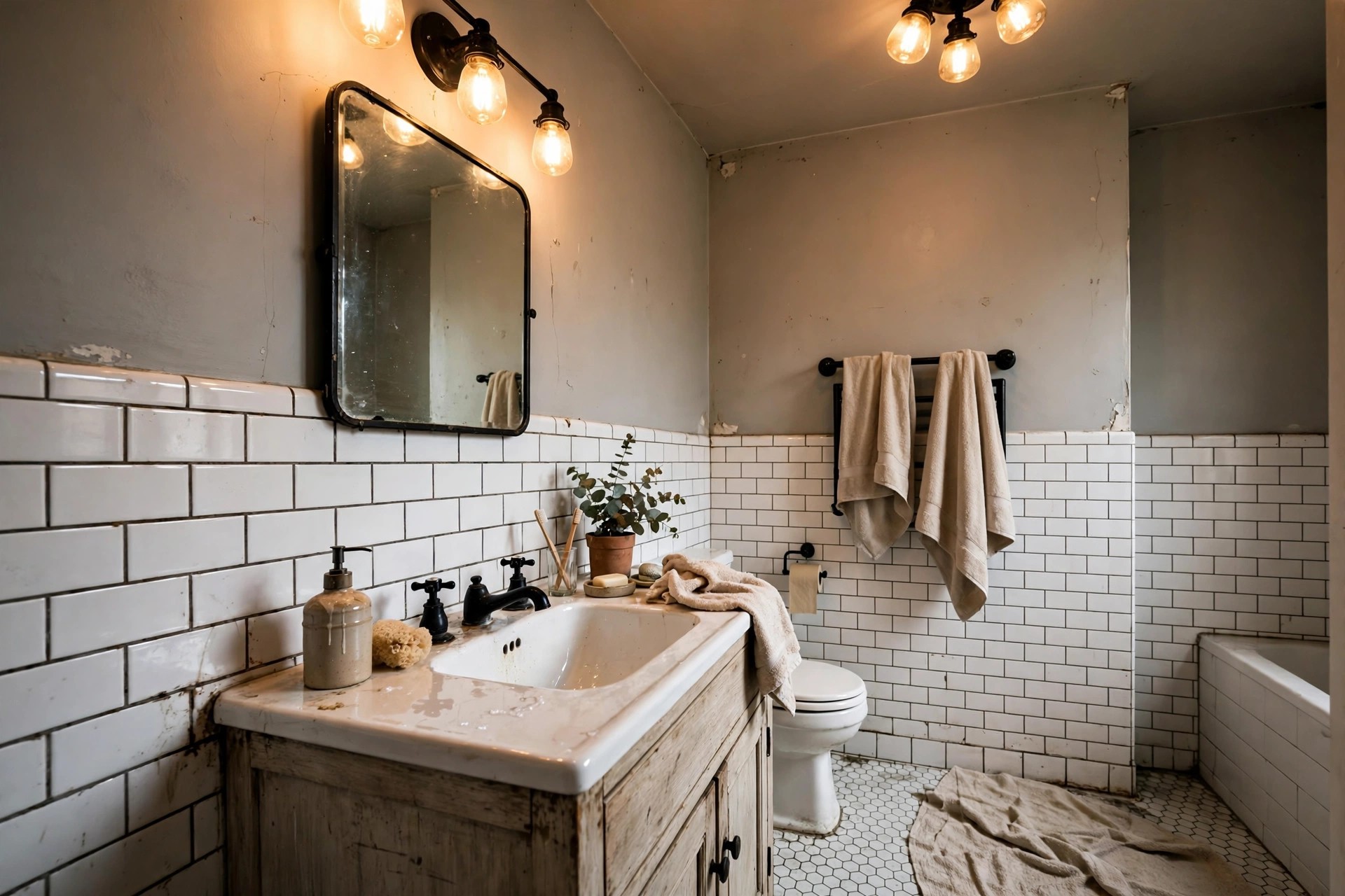
Light grey remains a favourite for good reason — it is calm, modern and endlessly versatile — but in a bathroom with no windows the undertone decides everything. A warm light grey, sometimes called a silvered greige-grey, carries a hint of beige or violet in its base and stays soft and welcoming under artificial light. A blue-based grey does the opposite, turning icy and faintly institutional the moment daylight disappears. Test greys more carefully than any other colour here, because their undertones hide on the swatch and announce themselves on the wall. Warm grey rewards you with a tailored, hotel-like backdrop that suits white tiles, black fittings and pale wood equally, and it layers beautifully with stronger colours in towels when you fancy a change.
9. Deep Navy for a Deliberate Jewel Box
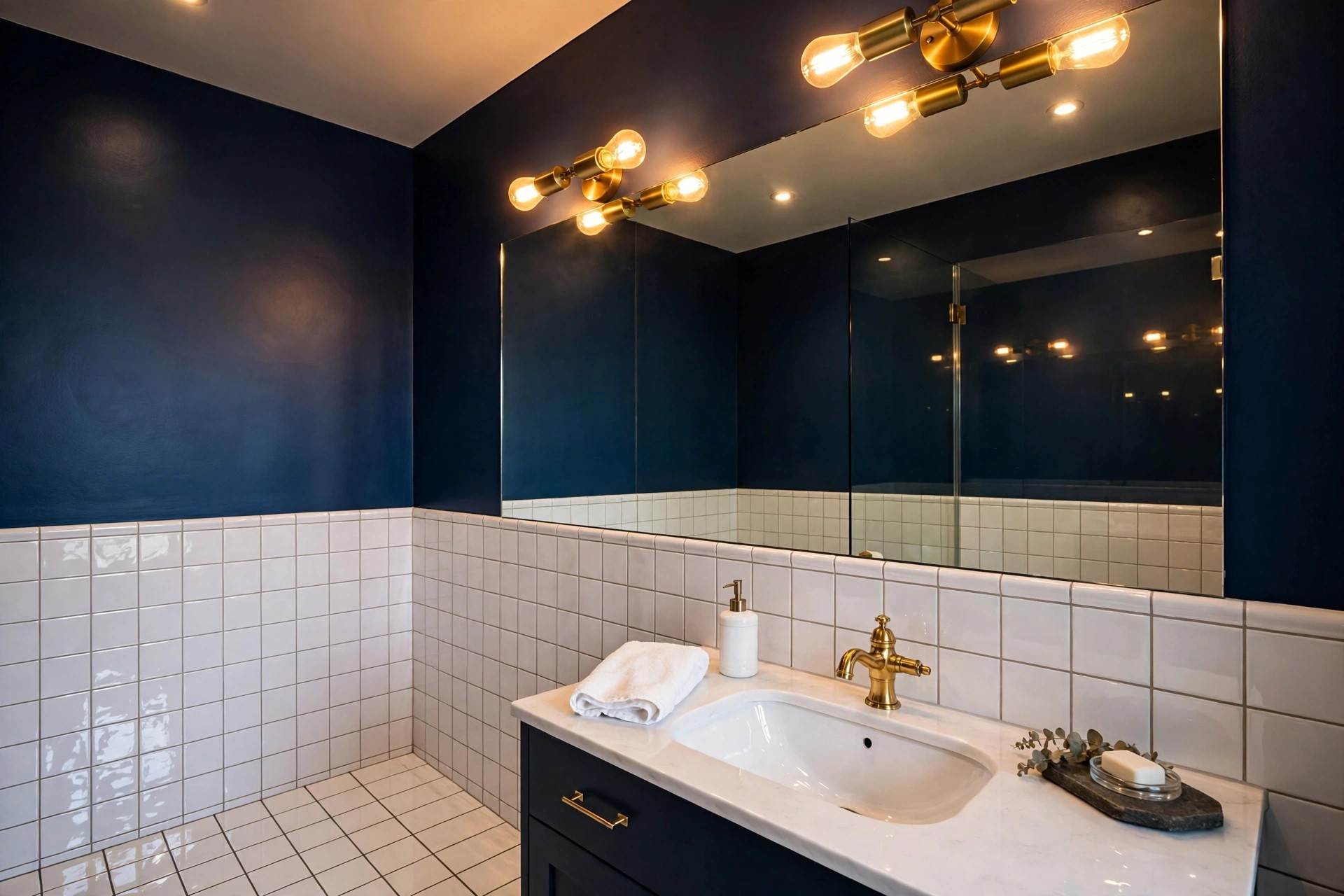
At some point it is worth asking whether a windowless bathroom should fight its darkness at all. Deep navy answers no — and makes the room a deliberate jewel box instead. Navy has enough blue in it to feel classic rather than heavy, and under warm mirror lights it glows with a richness pale colours cannot match. The rules for going dark are simple: commit fully, light it generously in layers, and add reflective touches — a large mirror, glossy tiles, warm metallic fittings — so the light has something to play on. If this direction tempts you, these small moody dark bathroom ideas show how far the look can go. Navy suits a guest bathroom or cloakroom especially well, where drama matters more than dawn practicality.
10. Rich Emerald Green, Dark Done Right

Emerald green is navy’s warmer, lusher rival for a windowless bathroom that wants to feel luxurious rather than bright. Its depth comes from a balance of blue and yellow, so under warm bulbs it reads rich and enveloping instead of murky — the difference between a boutique hotel washroom and a cave is entirely in the lighting you pair with it. Give emerald plenty of warm light at mirror height, keep the ceiling and sanitaryware crisp white for contrast, and finish with brass or gold-toned fittings that echo its warmth. Gloss or satin finishes deepen emerald further by catching highlights along the wall. It is a confident choice, but in a small windowless room confidence is exactly what makes dark colour read as intentional design rather than accident.
11. Charcoal for a Cocooning, Spa-Like Mood
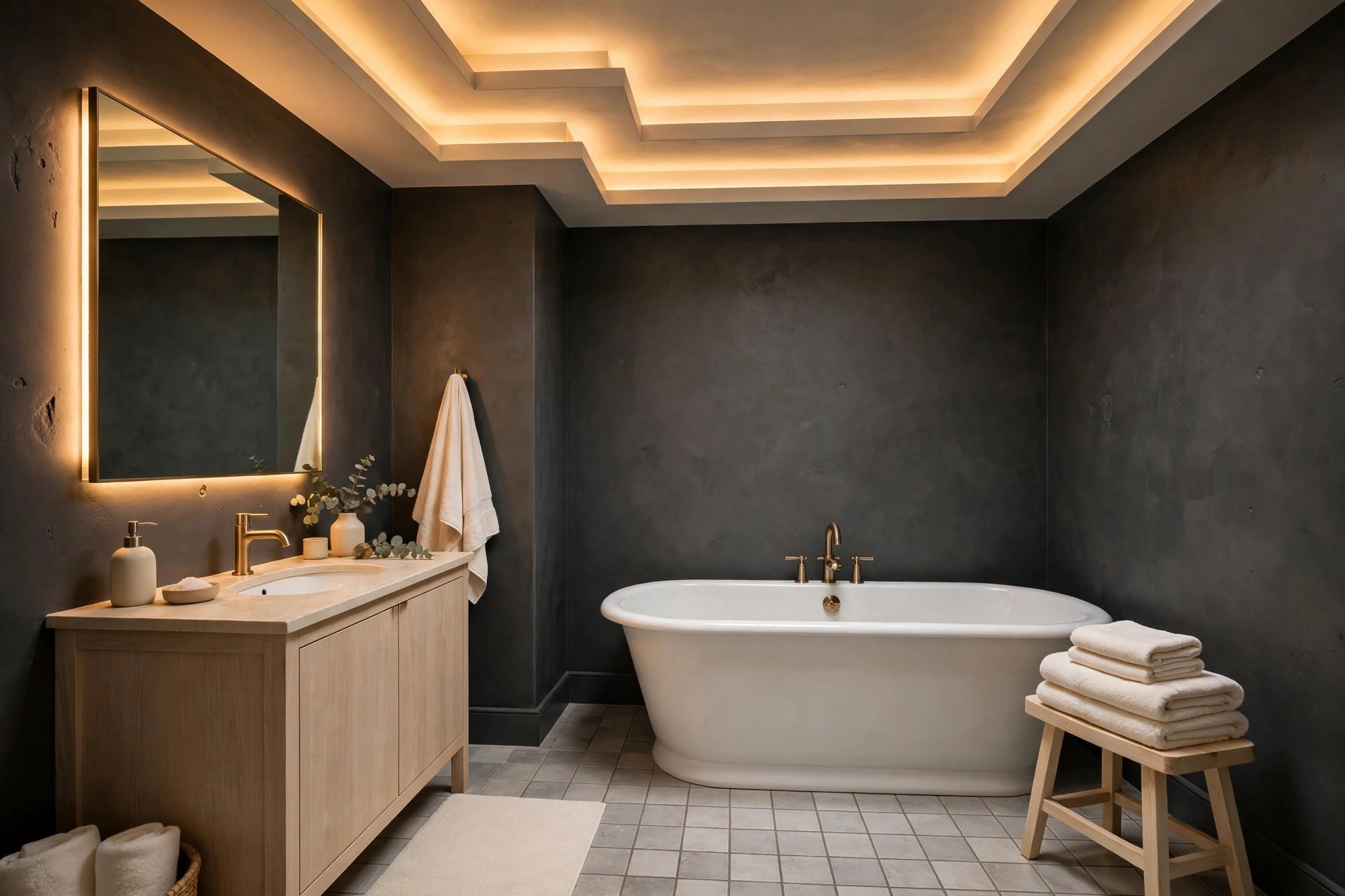
Charcoal offers the cocoon without the colour commitment of navy or emerald. A soft, warm-based charcoal wraps a windowless bathroom in a calm, spa-like hush, making evening soaks feel genuinely restorative and turning a plain box room into somewhere that feels designed for lingering. Because it is neutral, charcoal accepts almost any accent — pale wood and cream textiles for a soft, stony spa feel, or black fittings and white towels for something sharper and more graphic. Keep the lighting warm and layered, and consider painting the ceiling the same charcoal in a very small room so the boundaries dissolve completely. Just as with the other deep shades, texture matters: towels, wood and stone stop flat darkness becoming flat dullness.
12. Terracotta and Warm Clay Tones

Terracotta and warm clay tones bring something no pale neutral can: the feeling of sun-baked warmth held in the walls themselves. In a bathroom with no windows, a muted clay — softened with brown so it reads earthy rather than orange — creates a cocoon that feels Mediterranean and grounding at once. These shades are at their best with natural materials beside them: warm wood, stone-look tiles, woven baskets, a linen-look shower curtain. Keep the tone dusty rather than saturated, and balance the warmth with crisp white sanitaryware so the room still feels clean. Terracotta also hides the flatness of artificial light well, because its natural variation of tone gives walls a depth that flat colours have to work much harder to achieve.
13. Mushroom and Warm Taupe

Mushroom and warm taupe are the quiet achievers of the windowless bathroom — deeper than greige, softer than brown, and almost impossible to get wrong under artificial light. Their warmth is built into the pigment, so they never turn cold or grey when the door closes, and they give a small room a sense of substance that pale colours sometimes lack. Mushroom tones pair beautifully with stone and travertine-look tiles, unlacquered wood and aged metallics, building a layered, organic scheme that feels calm rather than decorated. They also make an excellent backdrop if your sanitaryware is plain white and staying: the contrast is gentle, flattering and very forgiving of everyday wear. Choose taupe when you want warmth with restraint.
14. Two-Tone: Pale Walls, a Deeper Lower Half
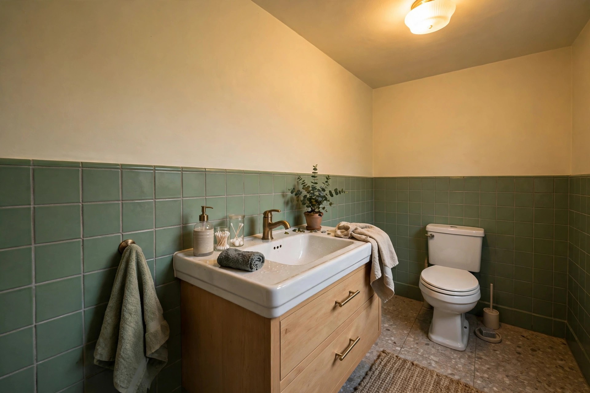
Two-tone painting solves two windowless problems at once. A deeper colour on the lower half of the walls grounds the room, hides splashes and scuffs where they actually happen, and gives the eye a strong horizontal line to travel along, while pale paint above keeps the light bouncing where you need it most — at face and mirror height. The divide can sit at dado height, at the top of a tiled splashback zone, or neatly behind the basin and bath line; a simple painted edge is enough, no rail required. Try warm white above sage, cream above clay, or pale greige above charcoal for a tailored look. Two-tone also lets the indecisive enjoy a dark colour daily without surrendering the brightness of a pale room.
15. Colour-Drench One Soft Mid-Tone Everywhere

Colour-drenching — painting walls, ceiling, woodwork and even the door in one single colour — sounds bold, but in a small windowless bathroom it is one of the most calming tricks available. With no white ceiling line and no contrasting skirting to chop the room into layers, the eye stops measuring edges and the space simply feels bigger and more coherent. The key is choosing a soft mid-tone rather than anything pale or extreme: a muted sage, a dusty blue, a warm mushroom or a gentle clay, in a satin finish that lets light slide softly across every surface. Sanitaryware and towels then provide the contrast. Drenching is also wonderfully decisive — one tin, one colour, no arguments about what goes where.
Common Mistakes to Avoid
1. Choosing pure brilliant white. It seems the obvious answer for a dark room, but pure brilliant white usually carries a cool blue base that only daylight can balance. Under artificial light in a windowless bathroom it turns grey-blue, flat and faintly chilly — the exact opposite of the bright freshness you wanted. A warm white will always look brighter here than a brilliant one.
2. Judging the colour under shop lighting or at midday only. Paint counters are lit to flatter every swatch, and a colour chosen there — or checked only in brief daylight — may never meet those conditions again in your bathroom. Your room has one light source: your own fittings. Test big patches at home, in the evening, with the door closed, before committing to full walls.
3. Picking a blue-based grey that turns icy. Blue-greys look crisp and modern on a chart, but without daylight to warm them they slide towards cold, steely and faintly clinical on the wall. If grey is your heart’s desire, choose one with a warm beige or violet base and confirm it on a large tester patch under your own bulbs first.
Frequently Asked Questions
What is the best colour to brighten a windowless bathroom?
A warm white or a pale warm neutral is the most reliable brightener, because warm undertones work with artificial light instead of fighting it. Keep walls, ceiling and tiles in the same warm family, choose a satin or eggshell finish so the surface returns a little light, and support the paint with layered warm lighting at the mirror. The room will read bright and clean at any hour.
Should the ceiling match the walls?
It can, and in a small windowless bathroom matching often helps. A ceiling painted in the same colour — or one gentle step lighter — removes the hard white line that lowers a ceiling visually, and it is the whole principle behind colour-drenching. If you prefer a separate ceiling colour, keep it warm and close in tone to the walls so the join stays soft.
What paint finish suits a bathroom with no window?
Satin or eggshell is the practical sweet spot. A windowless bathroom holds steam because there is no window to open, and these finishes cope with that daily condensation, resist marking and wipe clean, while their soft sheen reflects a little of your artificial light back into the room. Flat matt absorbs both moisture and light, so save it for ceilings at most.
Are dark colours a mistake in a windowless bathroom?
Not at all — they are only a mistake when they happen by accident. Deep navy, emerald or charcoal chosen deliberately, lit warmly in layers and balanced with mirrors, white sanitaryware and warm metallics can make a windowless room feel luxurious and cocooning. What fails is a mid-dark colour chosen timidly, with weak lighting: that combination reads as gloomy rather than designed.
Final Thoughts
A bathroom with no windows is not a problem to apologise for; it is a room with perfect, unchanging light waiting for the right colour to meet it. Start with undertone rather than names, test generously under your own bulbs in the evening, and choose a finish that can handle the steam. Whether you land on a warm white that never turns dingy, a sage that borrows the outdoors, or a navy jewel box that leans happily into the dark, the right paint turns the missing window into something you stop noticing altogether. And if you are renting, many of these shades pair happily with renter-friendly bathroom ideas with no drilling, so a full colour change can stay completely reversible. Pick the colour that makes you exhale when the light clicks on — that is the one.


