

How to Pick the Right Shade of Blue for a Living Room?
Choosing a blue paint color for a living room sounds simple until you stand in front of dozens of blue paint cards that all look slightly different. One may appear soft and airy, another gray, another almost green, while a dark navy can look sophisticated in one room and almost black in another. The same blue can also change noticeably from morning to evening as the natural and artificial light shifts.
That is why choosing blue should start with your room rather than with a paint trend. The direction of your windows, amount of daylight, existing furniture, flooring, ceiling height, and the atmosphere you want all influence which shade will work best. Designers continue to emphasize that light and undertones can dramatically change how a color is perceived.
Blue is particularly versatile because the family includes everything from barely-there powder blue to saturated cobalt, muted blue-gray, blue-green, indigo, and deep navy. Current interiors are also showing strong interest in both soft airy blues and more nuanced blue-green shades.
Here is how to narrow down the choices and find a blue that actually works in your living room.
This post contains affiliate links. If you buy through them, we may earn a small commission at no extra cost to you. See our Affiliate Disclosure.
1. Start With the Natural Light in Your Living Room
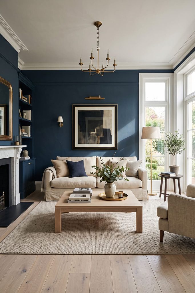
Natural light should be one of the first things you consider because it can completely change the appearance of blue. A room with large windows and abundant daylight can generally handle stronger or deeper colors more easily. A darker blue may appear rich and sophisticated rather than overly heavy.
A room with limited daylight needs more careful consideration. A very cool blue can sometimes make the space feel colder, particularly when combined with cool gray furniture and artificial lighting.
Do not choose a shade simply because it looked beautiful in another person’s living room. Your windows may face a different direction, your flooring may reflect different colors, and your artificial lighting may have a different temperature.
Before committing, place samples on several walls and observe them at different times of day. Color experts specifically recommend considering how natural light changes throughout the day rather than judging a shade under one lighting condition.
2. Understand Your Room’s Orientation

The direction your living room faces can influence how blue behaves. North-facing rooms generally receive cooler, less direct daylight. In these spaces, an extremely icy blue can sometimes appear colder than expected. A blue with a subtle gray or green undertone can be easier to live with.
South-facing rooms tend to receive warmer, stronger daylight. A soft blue can work beautifully here because the natural warmth of the light can balance the coolness of the color.
East-facing rooms can look warmer and brighter earlier in the day before becoming cooler later. West-facing rooms often experience the reverse pattern, with stronger warm light later in the afternoon.
This does not mean you have to follow a strict rule. It simply means the same paint can behave differently depending on the light entering the room. Designers continue to emphasize room orientation as an important consideration when selecting living room colors.
3. Decide How You Want the Room to Feel

Before choosing the exact blue, decide what you want to experience when you enter the room. For a light, relaxed atmosphere, look at powder blue, sky blue, pale blue-gray, or soft muted blue.
For something more sophisticated, consider medium denim, slate blue, muted teal, or dusty blue. For a dramatic and intimate living room, navy, indigo, or deep blue can create much more visual depth.
For a room that feels connected to nature, blue-green shades and muted teal can work particularly well. This step prevents you from choosing a color simply because you like it on a paint card. A beautiful blue can still be wrong if it creates an atmosphere completely different from what you want.
Current living-room guidance highlights soft airy blues for relaxed spaces and muted teal as a more expressive blue-green option.
4. Consider Pale Blue for a Light and Airy Room

Pale blue is one of the easiest choices when you want to introduce color without making the walls feel visually heavy. Soft powder blue, faded sky blue, and delicate blue-gray can work almost like neutrals. They provide more personality than white while remaining easy to combine with other colors.
These shades work especially well with cream sofas, warm white trim, pale wood, natural textures, brass, beige rugs, and soft patterned fabrics. Pale blue is also useful when you want a smaller living room to feel more open. Cool, lighter colors can visually recede, helping the walls feel less dominant.
Current design coverage has highlighted pale blue as an increasingly popular alternative to gray because it can provide a similarly versatile foundation while introducing more color and softness. If you are nervous about blue, pale blue is a good place to begin.
5. Choose Blue-Gray for a Sophisticated Neutral
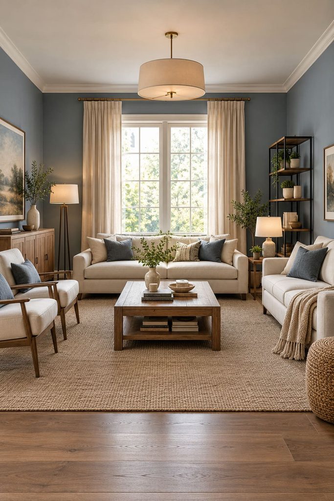
Blue-gray is useful when you want blue to feel understated rather than obviously colorful. These shades contain enough gray to soften the intensity of traditional blue. They can work particularly well with contemporary furniture, warm woods, cream upholstery, black accents, and natural stone.
However, be careful with the amount of gray. A blue-gray with very cool undertones can become cold when paired with cool white, gray furniture, and limited natural light.
If you like the idea of blue but normally decorate with neutrals, a muted blue-gray can be an excellent transition shade. Use warm cream rather than stark white around it, and introduce wood or woven textures to keep the room comfortable.
6. Look at Navy When You Want Depth
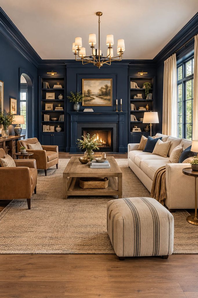
Navy is one of the most dependable choices for a dramatic blue living room. It can create a strong backdrop behind a cream sofa, make white architectural details stand out, and give a room a more intimate atmosphere.
Navy does not automatically mean the room will feel small or gloomy. The surrounding colors and lighting make a major difference. Pair deep navy with warm white, cream, beige, camel, natural wood, or brass. Add good lighting at several levels so the walls do not disappear into darkness after sunset.
A navy wall can also be particularly effective behind a television, fireplace, or sofa because the dark background creates a strong visual anchor. If the room receives plenty of natural light, you can generally use navy more confidently. In a darker room, test it carefully during the evening before painting all four walls.
7. Consider Blue-Green or Muted Teal

If traditional blue feels too cold, move slightly toward green. Blue-green shades can provide the calming quality associated with blue while introducing more warmth and complexity. Muted teal is particularly versatile because it can appear sophisticated rather than overly tropical.
The amount of green matters. A blue with just a subtle green undertone will look very different from a strongly turquoise shade. For a refined living room, look for muted teal, smoky blue-green, or gray-green blue.
These shades can work beautifully with warm wood, caramel leather, cream, dusty pink, muted green, and brass. Current color coverage identifies muted teal as an important living-room direction and notes that blue-green shades can function as a versatile backdrop for layered colors and patterns.
8. Check the Undertone Before Buying
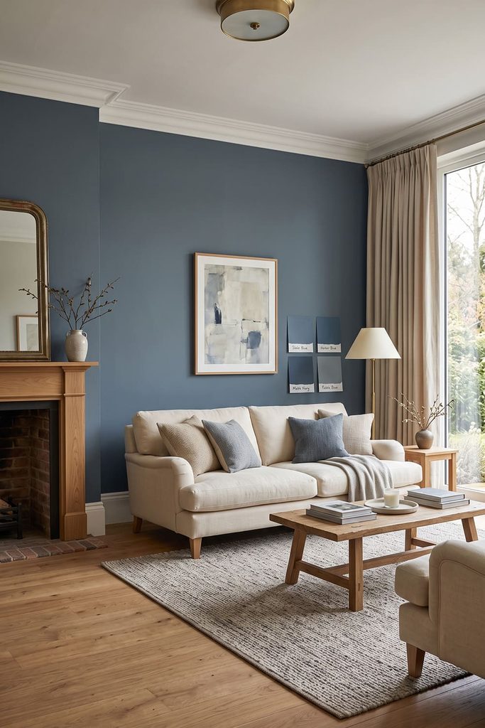
Undertones are one of the biggest reasons a blue paint can look different from what you expected. A blue may have a gray, green, violet, or even slightly warm undertone. Two colors that look almost identical on a small paint card can behave very differently across a large wall.
If your furniture has warm beige or cream undertones, an extremely icy blue may create an awkward contrast. If your room contains cool gray furniture, a strongly yellow or green blue might feel disconnected.
Look at your existing materials before choosing the paint. Examine the sofa, curtains, flooring, rugs, wood, stone, and major artwork. The goal is not necessarily to match everything. The goal is to avoid combinations where the undertones fight each other.
Designers increasingly emphasize examining undertones alongside existing finishes and lighting rather than choosing a paint color in isolation.
9. Match the Blue to Your Sofa

If you already own your sofa, let it influence the wall color. A cream sofa gives you considerable freedom. You can use pale blue, navy, teal, blue-gray, or medium blue. A gray sofa may work naturally with blue-gray, navy, dusty blue, or muted teal, but pay attention to whether the gray is warm or cool.
Brown or tan leather can look particularly attractive with deeper blue, dusty blue, and blue-green. The warmth of the leather prevents the blue from feeling too cold.
If you have a blue sofa already, you do not necessarily need blue walls. A warm white, cream, beige, or very pale blue can provide enough contrast. Think about the relationship between the largest pieces first. Accessories can be adjusted much more easily later.
10. Use Your Flooring as a Color Clue
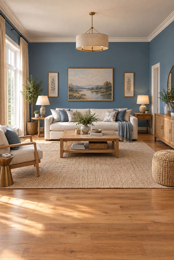
Floors occupy a large visual area, so they should not be ignored when selecting blue. Warm wood flooring generally works beautifully with blue because the brown and honey tones counterbalance the coolness of the color.
Cool gray flooring requires more care. A very icy blue combined with cool gray flooring, gray furniture, and bright white walls can make the entire room feel chilly. Beige carpet offers more flexibility. Almost any blue can work, although the undertones should still be considered.
If you have patterned flooring, choose a quieter blue wall color rather than competing with another strong pattern. The goal is to create a visual relationship between the floor and walls rather than treating each surface as a separate decorating decision.
11. Think About the Size of the Living Room
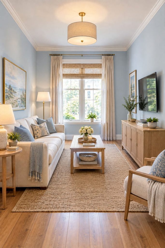
Room size should influence your choice, but it should not determine it completely. In a small room, pale or medium blue can help maintain an airy appearance. However, a deep blue can also create a cozy, enveloping atmosphere when used intentionally.
If you want the room to feel spacious, consider a lighter blue with warm white trim and relatively light furniture. If you want the room to feel intimate, a deeper blue can be used across the walls, particularly when balanced with lighter upholstery and thoughtful lighting.
You can also use a darker blue on one wall while keeping the remaining walls lighter. The important question is not simply, “Is my room small?” It is, “What atmosphere do I want this room to have?”
12. Test Blue Paint on More Than One Wall
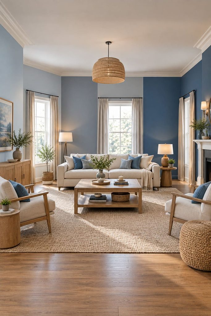
Never judge a blue solely from a tiny color card. Paint large sample boards or large sections of several walls. Move around the room and look at the color from different angles.
A wall beside a window may look completely different from the wall opposite it. One area may receive direct sunlight while another remains in shadow. Check the color in the morning, afternoon, and evening. Turn on the lamps you normally use at night.
This process can reveal whether the blue becomes too gray, too green, too dark, or too bright under different conditions. Current paint guidance repeatedly recommends sampling because natural light changes the appearance of colors throughout the day. A few extra days of testing can save you from repainting the entire room.
13. Think About the Colors You Already Own
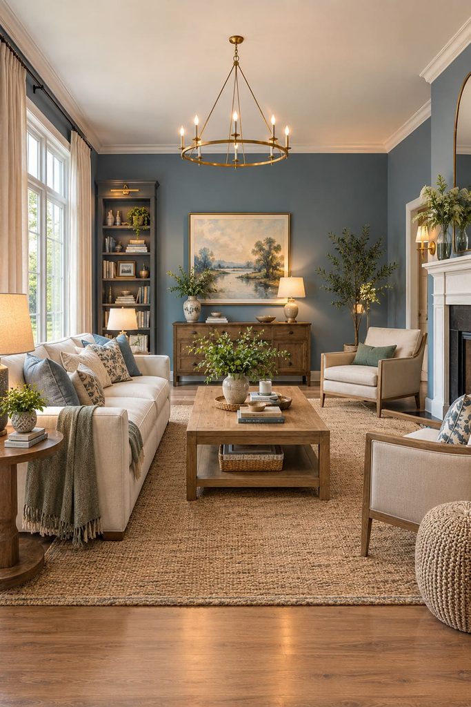
Do not choose blue in isolation if the room is already furnished. Look at your cushions, curtains, artwork, rug, furniture, and decorative pieces. Identify the colors that appear repeatedly.
If you have lots of warm beige and cream, a soft blue or navy can create a beautiful contrast. If you have natural wood and green plants, blue-green or dusty blue may complement the existing palette particularly well.
If your room contains black metal and modern gray furniture, a deeper blue-gray or navy may produce a cohesive contemporary result. You can also use one existing piece of artwork as the starting point. Pick out a blue from the artwork and use a related wall color rather than trying to introduce a completely unrelated shade.
14. Pair Blue With Warm Neutrals

One of the easiest ways to make blue feel comfortable is to surround it with warm neutrals. Cream, beige, tan, camel, warm white, and natural wood can all soften cooler blues. This is particularly helpful if you have chosen a pale blue or blue-gray with cool undertones.
For example, navy walls with a cream sofa and oak coffee table can feel sophisticated. Pale blue walls with beige upholstery and warm wood can feel relaxed. Muted teal with caramel leather can create a richer, more layered palette.
Current design advice increasingly favors warmer neutrals over combinations dominated by cool gray and bright white, partly because warm materials can prevent a room from feeling flat or cold.
15. Use the 60-30-10 Idea as a Starting Point
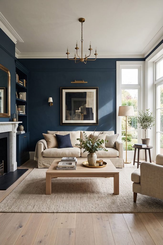
A simple proportion can help you control the amount of blue. You might use a neutral as the dominant color, blue as the secondary color, and a small warm accent as the third.
For example:
60% warm cream and beige
30% medium blue or navy
10% terracotta, brass, or muted green
You do not have to measure these percentages literally. Think of them as a visual guideline. If blue is the dominant wall color, the proportions can reverse. Deep blue walls may occupy most of the visual field while cream furniture and natural wood provide the balance. The useful part of this approach is that it prevents every object from competing for attention.
16. Choose a Blue That Works With Your Lighting
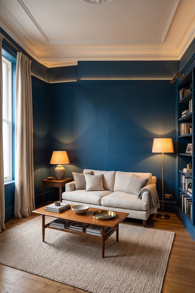
The paint is only one part of the equation. Your lighting determines how that paint will look after sunset. Warm lamps can make deep blue feel richer and more inviting. Cooler bulbs can emphasize the blue’s coolness.
If your living room is primarily used during the evening, do not evaluate your paint only in daylight. Turn on your actual floor lamps, table lamps, and ceiling lights while testing the samples.
This is especially important with dark blue because insufficient lighting can make a deep shade appear almost black. Designers also recommend using multiple light sources rather than depending on a single overhead fixture, particularly when working with richer wall colors.
17. Think About the Ceiling and Trim

The wall color is not the only blue surface you can consider. A very pale blue ceiling can create a subtle sky-like effect when used with slightly deeper blue walls. This can work particularly well in rooms where you want a calm, immersive atmosphere.
For a more traditional look, keep the ceiling warm white and use blue only on the walls. Trim can also change the appearance of blue. Crisp white trim creates strong contrast, while cream or a related soft neutral produces a gentler transition.
If you want a modern, enveloping room, you can even consider using the same blue across the walls and trim, but this requires careful sampling because color-drenching makes the shade much more dominant.
18. Consider Whether You Want a Timeless or Trend-Driven Blue
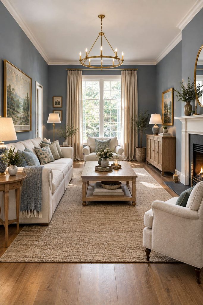
Trends can be useful for inspiration, but your living room does not need to follow every current color movement. If you want something that will remain easy to decorate around, choose a versatile blue such as muted navy, soft blue-gray, dusty blue, or a restrained medium blue.
If you enjoy changing your decor regularly, you can take more risks with saturated cobalt, vivid teal, or stronger jewel tones.
Current design coverage shows both soft blues and richer blue-green shades gaining attention, but designers also continue to emphasize choosing colors based on the room and personal preferences rather than relying solely on trends. A trendy blue can look beautiful, but the best shade is the one you will still enjoy seeing every day.
19. Match the Shade to Your Decorating Style

Your interior style can help narrow down the blue family. For a coastal-inspired room, pale sky blue, faded denim, soft blue-gray, and blue-green can work well with cream, natural wood, linen, and woven textures.
For a modern living room, consider navy, blue-gray, cobalt accents, or muted teal combined with clean furniture and restrained accessories. For a traditional room, dusty blue, medium blue, and classic navy can work beautifully with wood furniture, patterned fabrics, brass, and cream.
For a moody room, choose deep navy, indigo, or dark blue-green and balance it with warm lighting and lighter upholstery. There is no single “correct” blue for any style. The surrounding materials determine how the shade is perceived.
20. Trust the Room More Than the Paint Card

The most important rule is simple: choose the blue that works in your actual living room. A shade can look perfect online and completely different on your wall. A color that looks gray in the store may become soft blue in your room. Another that appears beautifully saturated under showroom lighting may become overwhelmingly bright in direct sunlight.
Use samples. Check them at different times. Compare them against your sofa, flooring, curtains, and artwork. Look at them with your normal lighting switched on. Give yourself time to live with the samples before making the final decision.
Quick Guide to Choosing Blue
If you want a bright and airy room, start with pale sky blue or soft blue-gray.
If you want a sophisticated neutral alternative to gray, consider muted blue-gray.
If you want a warm and natural atmosphere, explore blue-green or muted teal.
If you want a classic statement, navy is a reliable choice.
If you want a dramatic room, consider deep indigo or saturated navy.
If you want a lively contemporary accent, look at stronger cobalt or brighter blue.
If you are unsure, begin with a muted shade. Highly saturated blues are much harder to adjust once they dominate a large wall.
The Two Numbers to Check Before You Buy: LRV and Bulb Temperature
Every paint color has an LRV, or Light Reflectance Value, printed on the swatch card or the manufacturer’s website. The scale runs from 0 for near-black to 100 for pure white, and it tells you how much light the dried color will reflect. Pale blues tend to sit at the higher end and bounce light around a dim room, mid-tone blues fall roughly in the middle, and a deep navy can sit in single figures, absorbing light and feeling cocooning in a bright room but heavy in a dark one.
The second number is on your light bulbs. Color temperature is measured in kelvins: warm bulbs around 2700K to 3000K soften blue and can pull it slightly toward teal, neutral bulbs around 3500K to 4000K show it closest to the card, and daylight bulbs at 5000K and above make blue look crisper, bluer and sometimes icy. Check your shortlisted samples under the exact bulbs you use each evening, and note that an eggshell or satin finish reflects a little more light than flat matte, which matters most with dark shades.
Once the shade is chosen, put it to work with these ideas on how to decorate a blue living room, and if you are deciding what should sit alongside it, this guide on how to pair accent colors with a blue living room walks through warm and cool partners step by step.
Conclusion
Picking the right shade of blue for a living room is less about finding the most beautiful blue and more about finding the blue that behaves beautifully in your particular space.
Start with natural light, room orientation, existing furniture, flooring, and the atmosphere you want. Then consider whether you prefer a pale blue, blue-gray, medium blue, muted teal, navy, or deep indigo.
Always examine undertones and test large samples on the actual walls. Watch how the color changes from morning through evening and under your normal artificial lighting. A shade that looks perfect at noon may tell a completely different story after sunset.
Once you have chosen the blue, balance it with materials and colors that support it. Warm woods, cream, beige, brass, tan leather, natural fabrics, and textured accessories can prevent cool blues from feeling sterile. Current design guidance strongly supports this balance between cooler color and warmer materials.


