

15 Wall Art Ideas for a Guest Bedroom That Feels Like a Hotel
A guest room should help someone exhale the minute they set their bag down. Bare walls work against that feeling. They make the space look cold and a little forgotten, even when the bed is made and the towels are fresh.
The rooms people remember from a good hotel stay share the same approach. Art is calm, colors stay soft, and nothing on the wall competes for attention.
You can copy that mood at home with wall art ideas for a guest bedroom that focus on quiet subjects, balanced placement, and frames that look neat from the doorway.
If your bedding is already in place, start with neutral bedroom wall art ideas in beige and cream for a palette that works with almost any guest setup.
Each idea below keeps the same hotel logic in mind. Pick one main spot above the bed, add one or two smaller spots if the room needs them, and leave the rest of the wall calm.
Small choices like wide mats and low contrast color make a big difference at night and in morning light.
This post contains affiliate links. If you buy through them, we may earn a small commission at no extra cost to you. See our Affiliate Disclosure.
1. Hang a Matched Pair of Serene Abstracts Above the Bed
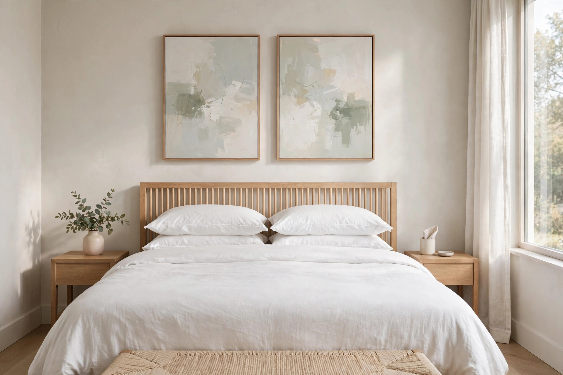
Two matching abstracts solve the most common guest room problem, a wide empty stretch above the headboard that makes the bed look lost. Choose a pair with soft brush marks in pale gray, warm white, and a hint of sage or dusty blue.
Hang them side by side with two to three inches between the frames and center the pair on the bed, not on the wall. Keep the bottom edge about six to eight inches above the headboard so pillows do not crowd the art.
A thin frame in light wood or matte white keeps the look quiet. Guests read the pair as calm background, which is exactly the job here. Check the pair at night too, since soft tones can look cooler under warm bulbs.
2. Let One Oversized Soft Landscape Do All the Work
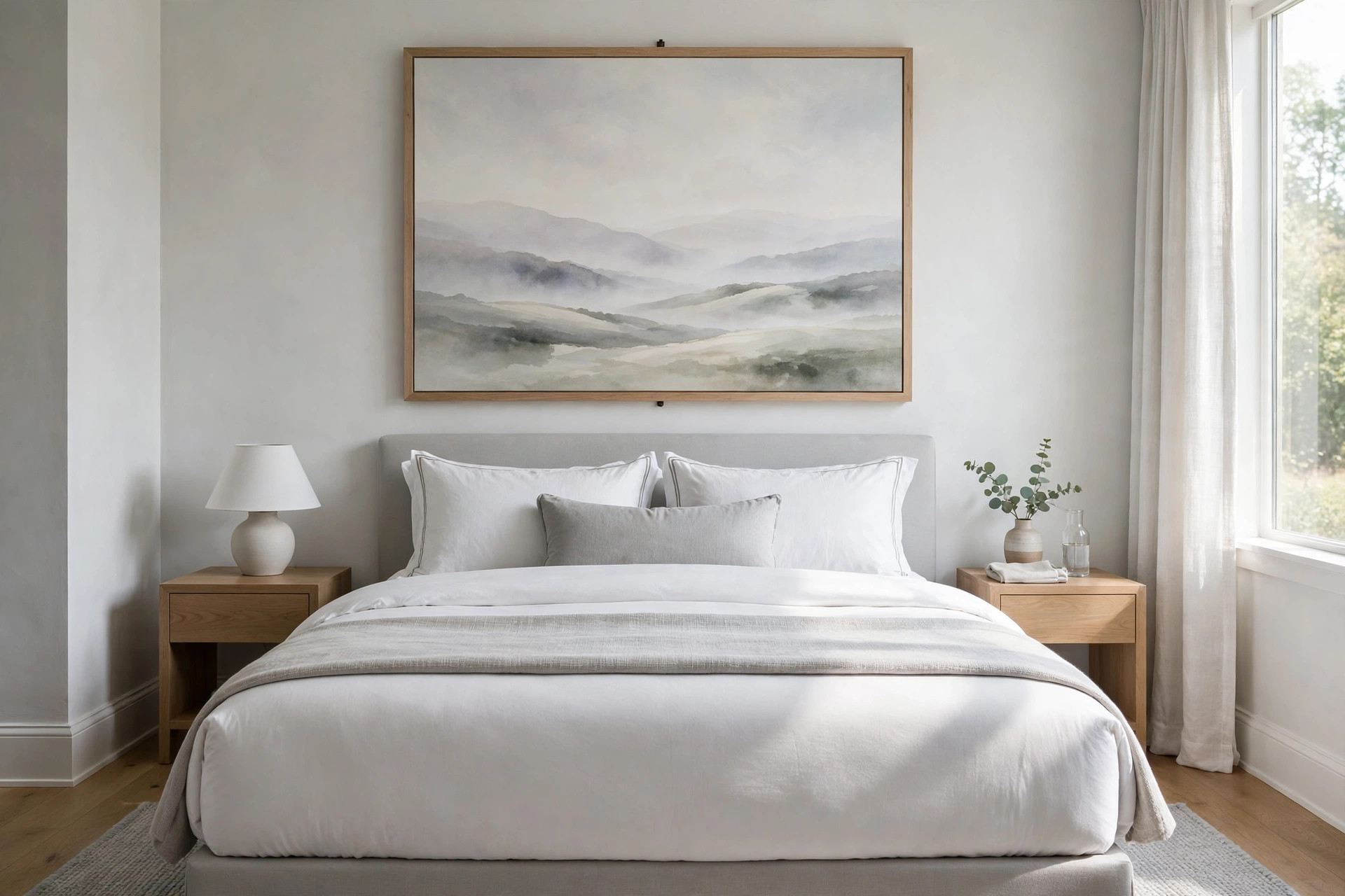
One large landscape gives a guest the feeling of space without adding visual noise. Look for a misty field, a soft hill line, or a pale sky with very little detail in the foreground.
The scale should cover roughly two thirds of the bed width so it feels settled, not small and floating. Hang it a little lower than you think, then step to the doorway and check the view a guest gets first.
If you want more options for this single piece approach, browse more guest room art inspiration for scale ideas. A single piece also means fewer nail holes and a faster reset between visits.
Keep the frame color close to the trim color for the quietest result.
3. Bring In Spa-Like Botanical Prints With Lots of White Space

To get that spa calm, choose botanical prints where the leaf or stem sits small on a bright white ground. Eucalyptus, olive branch, and soft fern shapes all work because the green reads fresh without turning bright.
Use two or three prints in the same frame size and line up the tops in a straight row. Place them on the wall a guest sees when they sit up in bed, or beside a reading chair if you have one.
Keep the glass non glare if the window faces the art, since morning sun can wash the image out. Folded towels on the bed and a small plant nearby finish the link without extra decor.
A plain white duvet keeps the green as the only fresh color in view.
4. Use Black-and-White Architecture Photos for a City Hotel Feel

Look closely at the contrast first. Soft gray tones in a black and white photo feel restful, while harsh black and white can feel cold in a bedroom. Pick architecture with curves, arched windows, a quiet street, or a bridge in light fog.
One photo works above a dresser, and a grid of four small photos works above the bed in a smaller room. Keep frames identical and mats the same width on all sides so the set looks ordered.
This style suits a guest room with white bedding and a gray throw, where color art might fight the linens. Wipe the glass before guests arrive, since dust shows fast on dark frames.
Leave a small gap between the bedside lamp shade and the nearest frame edge.
5. Soften the Room With Pale Coastal Prints

A pale shoreline print lowers the energy in the room in a good way. Choose sand, soft water, and a wide sky with no boats, no text, and no bright umbrellas. The image should feel quiet from across the room, not busy up close.
Hang a horizontal print above the bed or a vertical pair on a narrow wall near the door. This direction pairs well with the clean lines in modern bedroom wall art ideas if your furniture is simple and low.
Add a woven tray or a light wood bench at the foot of the bed to echo the sand tone without adding a theme. Keep other wall decor out of this room so the shore view stays the focus.
6. Line Up a Triptych With Wide White Mats

Rule of three, with air around each part. A triptych reads as one calm story when the three panels share the same subject, the same mat width, and the same frame.
Wide white mats, at least three inches on each side, give the art that gallery calm hotels use so often. Keep gaps even, about two inches, and use a level for the center panel first, then match the sides to it.
If height feels tricky, check these rules for hanging art at the right height before you drill. From the bed, the white space does as much work as the image itself.
Step back to the hall and confirm all three panels read as one calm row from the bed.
7. Choose Framed Line Art for a Light, Uncluttered Wall

Start with one thin line drawing of a face in profile, a pair of hands, or a simple vase shape on warm white paper.
Line art suits a guest room because it adds interest without adding color you have to match later when you change the bedding. Use a larger frame than the drawing needs so the white border becomes part of the calm.
Hang a single piece off center above a small desk or chair, or hang two in a vertical stack on a narrow wall. A black or warm wood frame gives the thin line enough weight to hold the wall.
Keep nearby surfaces clear so the simplicity reads as a choice. A small plant on the floor nearby adds life without crowding the drawing.
8. Match Muted Art Colors to the Bedding Already in the Room
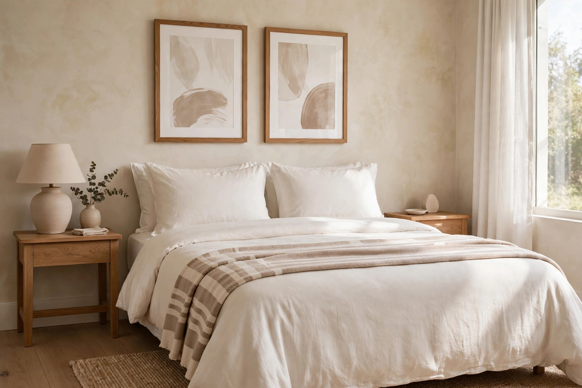
The fastest way to make a guest room feel planned is to pull two colors straight from the bedding and repeat them in the art.
If the quilt is warm white with a clay stripe, look for prints with warm white ground and a soft clay or taupe shape. You do not need an exact match. Close is enough, and a slight shift in tone looks more natural in daylight.
Lay fabric swatches or the pillow sham under the print in store light or near a window before you buy. Hang the art, make the bed with the throw folded flat, and view the wall from the hall.
When the colors agree, the whole room settles. Take a phone photo in daylight to check the match before you hang anything.
9. Add One Woven Texture Piece for Warmth Without Color

Guests notice texture at night, when lamplight casts soft shadows across the wall. A woven hanging in natural cotton, wool, or jute adds that warmth without bringing in a new color to manage.
Choose a simple weave with a straight bottom edge or a gentle fringe, and keep the width near half the bed width if it hangs above the headboard.
Mount it on a plain wood dowel and check that it hangs flat, with no curl at the corners. Dust it with a dry cloth before each stay, since open weave holds dust.
Paired with smooth white bedding, the contrast in texture is the whole point. Keep the weave in natural tones only, so it works with any bedding change.
10. Leave Generous Breathing Room Around a Single Print

Many guest rooms fail because every wall gets filled. Try the opposite. Hang one medium print on the largest wall and leave the rest of that wall empty. The empty space signals rest, the way a hotel room leaves a wall bare on purpose.
Center the print at eye level for a standing adult, then stop. No sconce art, no small frame tucked in the corner, no shelf above it.
This works very well on the kind of long plain wall covered in bedroom wall art ideas for blank walls, where restraint often beats a large gallery. A clean baseboard and a made bed complete the calm.
Resist adding a clock or a sign to fill the quiet on either side.
11. Place Small Matching Prints Above Each Nightstand
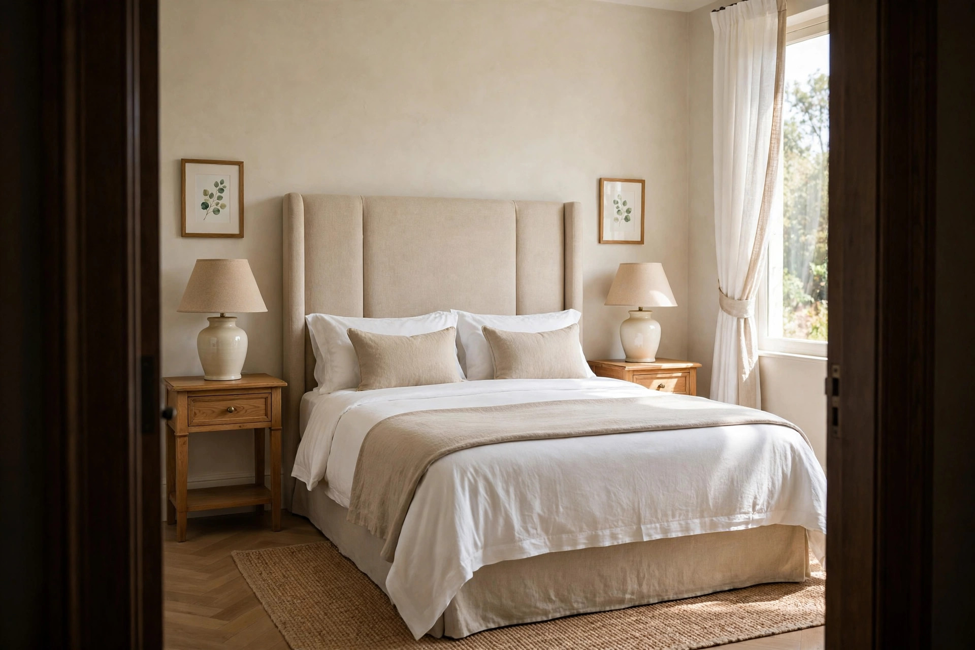
A common slip is to hang one small print in the center and leave both sides of the bed bare, so the wall looks lopsided from the door. Fix it with two small matching prints, one above each nightstand, at the same height.
Keep each print modest, roughly the width of the nightstand or a bit less, so lamps do not fight the frames. Use the same mat and frame on both sides even if the images differ slightly, like two views of the same shore.
Guests who read in bed like the balance, and the symmetry helps a small room feel orderly. Leave the space above the bed itself empty if the headboard is tall. Mark both spots with tape first and view them from the doorway together.
12. Pick a Calm Horizon Print for the Wall Guests Face in Bed
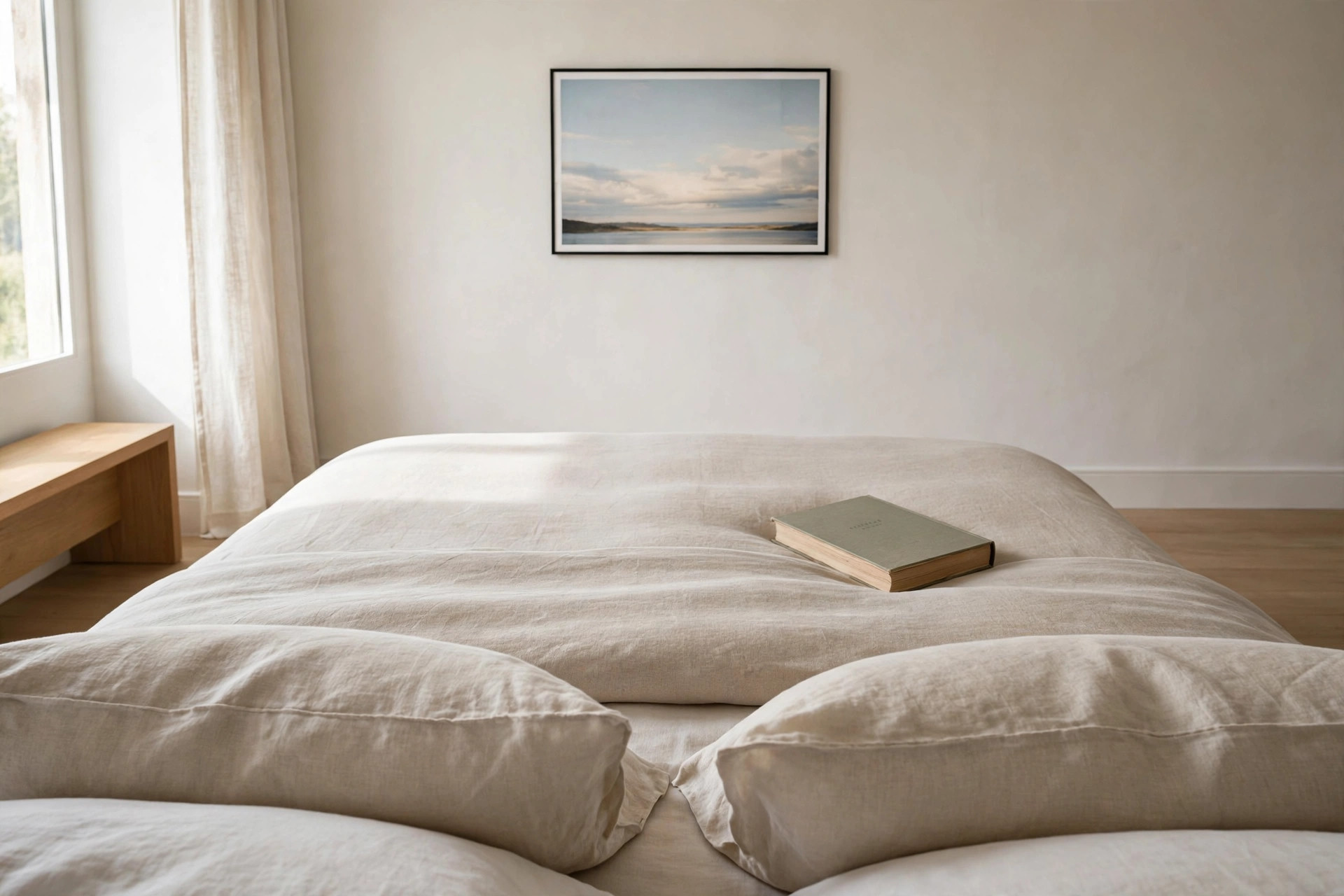
Compared with a busy gallery wall, a single horizon line gives tired eyes one soft place to land. Choose a print where the horizon sits low, with more sky than land or water, in pale blue gray and warm white.
Hang it on the wall opposite the pillows, at a height a guest can see while sitting up with a book. Keep the frame slim so the image feels open.
In my own guest room, this is the piece visitors mention most, often because it is the last thing they see before sleep. Avoid sunsets with strong orange here, since warm bright color can feel alert at bedtime.
A thin white mat around the print widens the sense of open sky further.
13. Layer Leaning Frames on the Dresser for a Collected Hotel Feel

Set two frames on the dresser and lean them against the wall, the larger one at the back and a smaller one overlapping its front corner.
This layered look is how boutique hotels make a room feel gathered over time rather than decorated in one day.
Use one soft landscape and one simple sketch, both in quiet tones, and leave space on the dresser for a guest bag, a water glass, and a phone charger.
A small stack of books under the smaller frame can level it if the dresser top is uneven. Because nothing is hung, you can swap the front print in minutes when seasons change or when new guests arrive.
Keep the frames in the same finish so the layered look still feels tidy.
14. Commit to One Statement Piece in Soft Neutrals
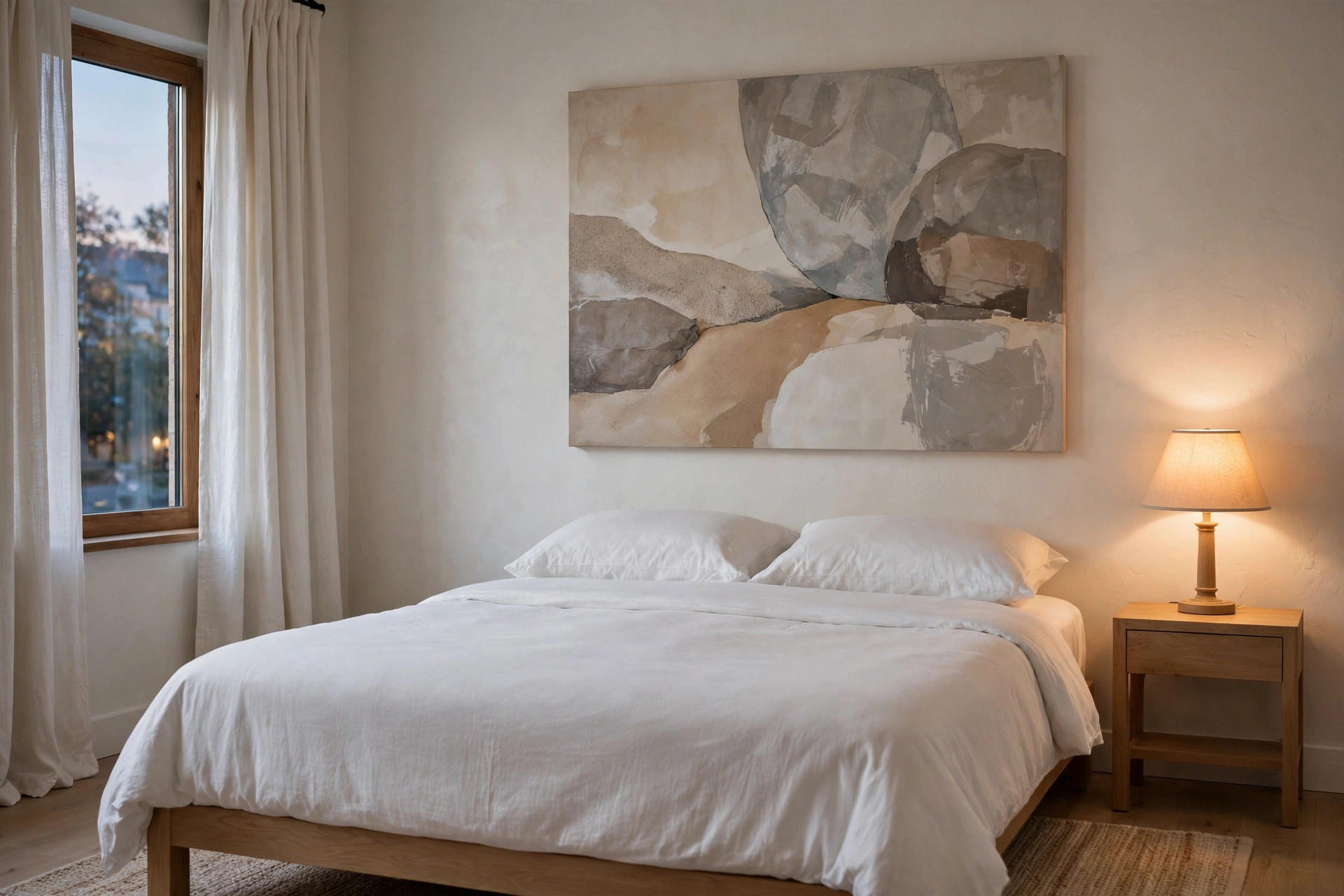
You do not need a wall full of art to make a guest room feel finished. One statement piece in soft neutrals, hung with care, often does more than five small frames.
Look for a large abstract with broad, slow shapes in stone, sand, and warm gray, with no sharp contrast and no busy center. Give it the main wall, keep the bedding plain, and let the curtains stay simple.
Stand in the doorway with the evening lamp on to check for glare on the surface. If the piece still looks calm in low light, you have the right one. A folded throw in a matching neutral ties bed and wall together.
Do not add a second piece later, since the single focus is the strength here.
15. Finish With Understated Gold or Black Frames, Used the Same Way Throughout
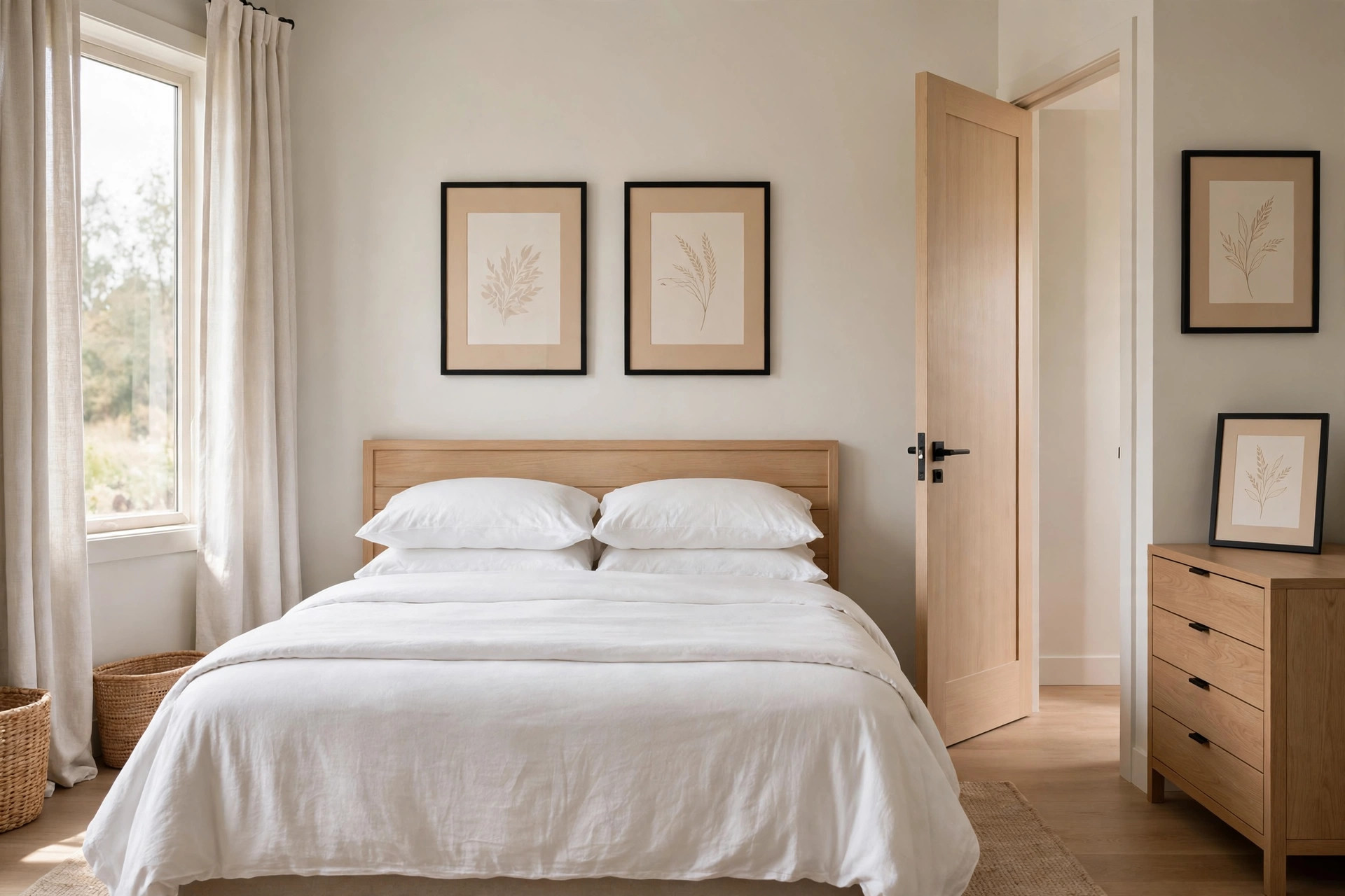
Frame choice is the detail guests feel without naming it. Hotel suites repeat one slim frame finish across the whole room, either brushed gold with a warm, low shine or matte black with a thin profile. Copy that rule here.
Pick one finish and use it for every framed piece in the room, above the bed, by the door, and on the dresser. Mixed frames make even calm art look random.
Keep the profile thin so the image stays in front, and choose mats in the same warm white for every piece. Before guests arrive, check each frame for fingerprints at lamp height and wipe them clean. Consistency is the quiet signal of care.
That single repeated finish is what makes separate pieces feel like one hotel set.
Start with the wall above the bed, since that is the view that sets the tone for the whole stay. Add one smaller spot only if the room still feels bare, then stop and live with it for a visit or two.
The best wall art ideas for a guest bedroom keep color soft, subjects calm, and frames consistent, so guests rest instead of reading the walls.
Save this to your bedroom board for later, and use it as a checklist the next time you get the room ready.


